[dexterming]Newbie looking for advice! Come help!


dexterming

New Member
Sep 28, 2010
15
0
0
5345708940_15520d7ba8_z.jpg


1. In which area is critique or feedback to be given?
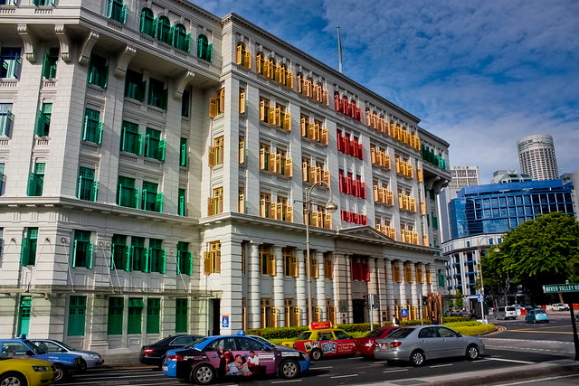
From captured angle to composition to post processing

2. What were you hoping to achieve with this image?
Great composition and captured angle

3. Under what circumstance was the picture taken? (physical conditions/emotions)
attraction to the nice colours

4. Thread-starter's personal thoughts about the image.
Been holding the camera for 3 months. Learning and gaining experience as each day pass by. Trying out tips that i gained from watching youtube tutorials. My first time output a picture from start to the post processing.
 

Last edited:
Hey fellow newbie,

I agree the colours are nice. IMHO, this pic appears to be more of a well-captured snapshot rather than any creative work. Not that I'm some expert but would just like to share my views if you don't mind...

1. Sorry but I don't quite like the composition. A little bit of too many things within the frame; you could have just focused on the colours of the MICA building's windows if that was your interest.

2. The angle is pretty snapshot style. I would have tried a different perspective from the foot of the building (not from across the road), standing beside one of the green windows on the left and shooting diagonally upwards to capture the other two coloured windows with some sky at the top of the frame. Never done it before but something tells me it should look nicer. Or even a direct head-on shot could have worked better I guess.

These are just my opinions. I've got much to learn just as you do. Keep viewing the great works here and continue shooting. I'm sure you'll improve with time... Cheers!
 

Your photo look like a snapshot... Where people say: Oh, what a nice rainbow window, lets take a picture of it and post it on facebook.

Tips i suggest to you. Remove blue building from the picture. Not from your original picture but take it from where you took this picture again! But as Neurospark said, i strongly suggest you shoot from the foot of the building...

Avoid small destructing detail like the signboard...

+++ Write down note on your phone, small notepad about the iso, f, ev and alot more.

Every time you go out shooting, take a look at your note and see what setting is best recommended for that environment..

Slowly, from 3 month to 3 year, you can take great picture like others else.
Chinese saying: 台上三分钟台下十年功

Cheers :D
 

The building is slanted and there are too many distractions (cars, tree, etc...). Perhaps you should shoot from another perspective take note of your composition. And next time, think of a proper subject that matches what your picture tells.
 

u mizzed a good composition. I would hv selected the steel bridge across the road with MBS in the background.

if u r lucky, u will get a nice shot during the golden hour.

but if u r adament about this building, i would do a symmetrical shot at the building.
 

Last edited:
Hi Gurus,

Thanks for the advice!

@Neurosparks: Saw your Cambodia pictures. Really good. Mind if you share how you do the post processing of your images?
 

Hi Dexter,

Thank you for viewing my pics. Really appreciate it. Anyways, I use Adobe Lightroom on my mac for the post-processing. For the Cambodia series, I used different styles for the different moods. For example, the Tonle Sap Lake photos were processed to cut down on saturation and increase contrast with some hue / toning adjustments to give the photos some "feel". I dunoo if that is the best PP for those kind of photos but I like them that way. Of course the sunsets were processed differently, with some gradients added to accentuate the colour and contrast of the sky. For the killing fields and genocide museum pics I tried to work with B&W processing as I believe that brings out the cold and eerie mood of the photos. The Angkor series was processed with a more vibrant and saturated feel to make the ancient architecture stand out. I hope this explains what you are looking for... In case you have any particular photo you wish to see in particular, I can post the before and after pics for your reference... Do let me know yeah? Once again, thanks for viewing my work! Cheers and have a great weekend!
 

In my opinion the image is too pack;give it a bit of space helps. Think about the space around your subject and little bit more of the context helps anchor the image...
 

Alway know what is your subject before you press the shutter. In this photo, I can't figure out what you are trying to show.
 

Alway know what is your subject before you press the shutter. In this photo, I can't figure out what you are trying to show.

It is obviously what he is trying to show is the building that took up 60% of the photo.

For the TS. At the left see how the building's edge is slanted with respect to the left margin. IT is important to note this for structures photos. The thing that is wrong here is the spot you are standing at is not ideal. Get a better spot.
 

Hi there.
Me newbie just like you :)
I do think your composition is actually not so bad (someone commented about removing the blue building, I agree on that or at least give it less picture).

The thing is your subject in the frame - everything is in focus - building, cars, tree - which makes it all the subject and therefor no subject. If I were u, I'd like maybe to blur the cars - maybe let them pass and provide motion blur so they are taken off from the viewer's mind. How to do that - I dont know, as said I'm a newbie just like you.

btw, colors are nice and the skies are interesting too.
good luck!
 

Last edited: