Critique appreciated


Status
Not open for further replies.

Tony275

New Member
Jul 23, 2005
9
0
0
UK
www.flickr.com
Hi All, I was wondering if you had a spare momnet, If you could take a look and give me some Critique on these pic's.


commonblue800x.jpg


messyeatercrop600x.jpg


P1070172.jpg


Other Photo's can be viewed here. http://www.flickr.com/photos/tony275/

Many Thank's Tony
 

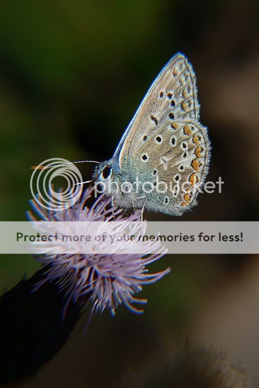
photo#1: good subject (interesting: patterns and colours), good focus, good depth of field, and good lighting (highlighting the front edge of the wings and some details in flower centre). only downside is that second antenna is not in view and first is slightly blurr. how close were u to the butterfly and did u have a DOF checker on ur camera?

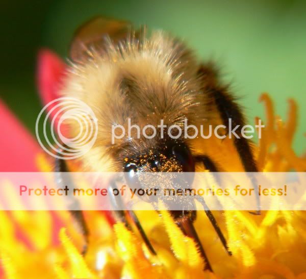
photo#2: confusing. i know its a bee but do not see one. I only see the fine pollen on its head. and everything else is furry blurry.

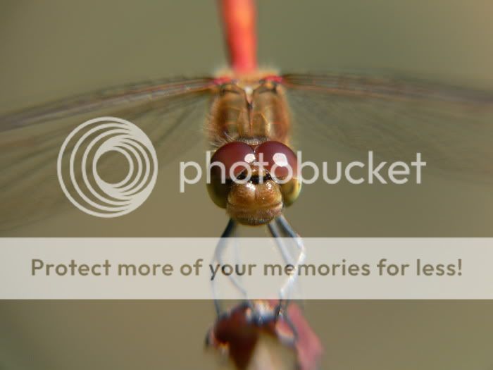
photo#3: good focus on the eyes, but thats all. not enuff for an interesting pic. maybe more DOF to include the fine details of the wings. and a closer crop, if fine hi res details is what your photo is about. right now the crop look off as the rear end of the drangonfly is cut.
 

#1 the composition works for me with the exception of the distracting flower at the bottom. A tighter crop perhaps ...

I like the movement the the image seems to portray but the focus should technically be on the eye/face.

#2 and #3 looks soft and the composition does not work for me.
 

you probably want to read the guidelines here point a) in red.

I'll just pick the first pic to comment.
As you notice, the whole butterfly is distorted. For butterflies you want the wings to be parallel to the sensor plane. You have probably focussed in the centre of the butterfly, with the eyes slightly oof. Composition wise, the diagonal flowing stalk to the butterfly works for me. You might be able to up the contrast of the mimosa purples a bit more to add more punch to the picture.
 

Tony275 said:
Hi All, I was wondering if you had a spare momnet, If you could take a look and give me some Critique on these pic's.

It seems you're using something like a hand-held loupe for closeup. In the first picture in particular, there is tons of abberations that blur most of the picture. It looks like the closeup lens was severely off-center and/or tilted.

The blurriness and colour fringes are less pronounced in the other pictures, but still enough to strike the eye. Using a smaller aperture would not only reduce these artefacts, but also give more depth of field which is too narrow for my taste.
 

Thank you all very much, I hope to be able to address the faults you outline and in so take some better pic's.

Thanks Again Tony
 

P.S sorry about posting to many pic's, I should have read the guidline's more clearly. It won't Happen again.

Tony
 

Status
Not open for further replies.