Cranes


Status
Not open for further replies.

CupNoodle

New Member
Dec 21, 2003
65
0
0
44
Singapore!
www.visuallyentertained.com
Up for ur comments and opinions.

Cranes.jpg
 

I like the word "cranes". The fonts. Sniper has a point.
 

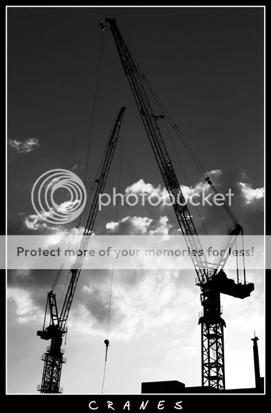
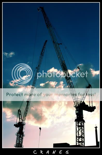
i think colour works fine for this image, the blue in the skies is a nice, deep blue, and the photo is already a very simplistic, almost monotone--just black and blue and white, with almost no other colours already.

nice, clean, simple photo...i just love the colours. :)
 

I agree with fw007 :) ... the gradient of the sky is nice and there's quite enough contrast btwn the cranes' silhouette and the sky for most parts ... i think it's a nice take ... was there another angle for a shot of a single crane? - am trying to visualise if an even less cluttered shot would make a stronger pic ....
 

To me, the BnW one stands out better. There's beauty in monochromes. Simple, cleancut tones and the meaning jumps out at you.

THe color one works oso just that the background is overexposed.

Try a little burning to the clouds. The top portion looks alittle cut-out which can be solved with burning some depth to it :)
 

BnW works best for this one.
better still if you can clone out those buildings and leave just the cranes.
 

Status
Not open for further replies.