
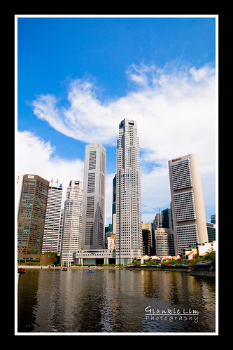
Hi all, please give comments and/or vote between these two pictures (001 or 002), which editing is preferred.
001
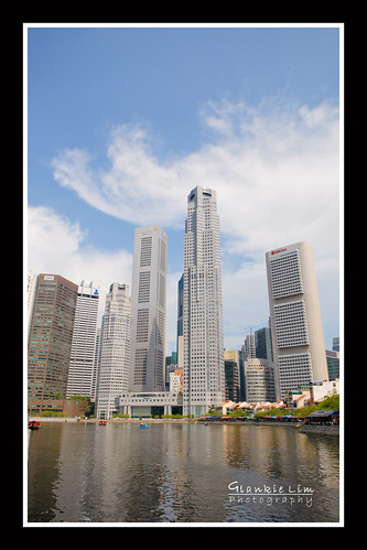
002
001
002
ok, i prefer the edited version. btw wat was the focus at? the buildings? and the picture seemed kinda blown out to me at some points. just my two cents worth
ok, i prefer the edited version. btw wat was the focus at? the buildings? and the picture seemed kinda blown out to me at some points. just my two cents worth
if i'm not wrong both pictures are edited. :sweat:
First one is better.
The increased colour saturation improves the contrast for the elements in the photo.
I also prefer the first one... But please pull back the on the saturation for the blue channel. The sky is looking very unnatural.
First one is better.
The increased colour saturation improves the contrast for the elements in the photo.
yup! agree!! #001's colours are much more pleasing to the eye. #002 looks little dull.
A pointed out, 1st one is better but only in some ways. The contrast in the buildings is good but the sky is not. 2nd one is just too washed out to make the photo appear interesting. Given this, I would do a B&W conversion based on the 1st.