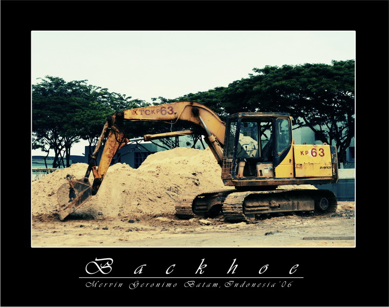
it seems like this photo with the design of the frame and fonts, is worshipping the subject - the construction machine being right smack in the centre of the photo. this is just plain weird.
the subject has almost equal amounts of space around it, which makes it boring. you can try using the basic rule of thirds to increase the compositional value.
the play with tones must serve a purpose, which i cannot seem to get a finger on. the "soft", curly fonts seem to clash with the machine being a "hard' subject. other than these, i think it is a bit soft and underexposed.

")