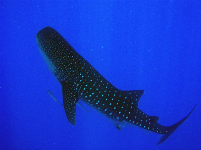
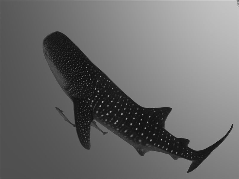
for the whaleshark, neither works becos it looks too much like a painting. The blue is un-natural and the B&W is worse
In a sense agree with you.
I don't really like either color or b&w pics for this. It's a shame 'cause I like the composition.
I may try to give it another go from the 'out-of-the-box' picture later.
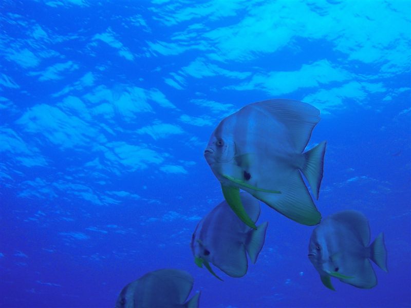
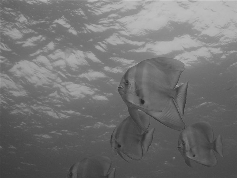
but the batfish works. I still find the blue too saturated and thus i like the B&W more. it would be great if the 4th fish which was cut off at the bottom wasn't there.
Eric
Point noted on the blue's saturation. Missing light on the original picture: it's quite blue originally and trying to get some contrast was not done in the best way I guess.
antacid said:
Hi Pierre,
Good to see someone experimenting with B&W too.
Here are my thoughts:
1. the conversion seems to lack a little contrast, and doesn't really bring out the subject
2. its quite the opposite from #1. the contrast is definitely there, but might be a little over-done, such that the 'black' on the whaleshark is overwhelming.
I find that in B&W, its not the black or the white that matters..its the grey that makes a good B&W photo.
Finally, care to share how you did the conversion?
How did I do (as much as I can remember
")
)
Batfish:
1. Simple post processing on white balance, contrast and brightness.
2. Simply convert the image channel to B&W
3. A bit more manual playing with contrast and brightness.
WhaleShark:
lot more work here: surely too much actually
1. Isolated the ws from the back ground on a specific layer
2. Convert the ws channel to B&W
3. Bit of PP on contrast and Brightness to sharpen the details
4. Manually (with pencil) remove some noise and 'anti-aliases' around the subject
5. created a background from scratch in the same tone as the B&W-converted original one (using a gradient of grey) --> It means the background it not even coming from the original picture.
All of this done with 'The Gimp' (Freeware image editing)
lovells19 said:
seems a little over PS to me..
neither works
Noted.
I guess the 3 of you a right. Looking at the pics again now, they really look 'artificial' (particularly the color ones).
Thanks for all comments. I'll surely try it out again...
And let you know, if you don't mind ;p