Clouds


Status
Not open for further replies.

ruikang89

New Member
May 9, 2008
81
0
0
Sembawang
www.wix.com
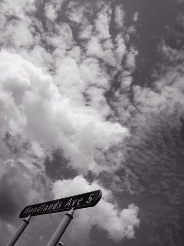
Did a B/W conversion, and adjusted the colour balance to achieve this end result.
As usual, taken with a K800i.
Want to know the overall feel this picture gives you all, the composition (especially the Woodlands sign), and whether the colour works.

2615102133_4bcfec908b.jpg
 

I think black and white is fine. There's too much cloud and it's quite messy.
 

it doesn't look very nice with the whole chunk of cloud on the left... i think it would be better with more patchy clouds rather then cotton candy (chunky) on the sky... nice try though ;)
 

I guess the photo does not work for me as well.
Wonder what is your intention to include the signboard?
It does not really help much in this picture.

Agreed with JinmingGM that patchy cloub covering the whole frame will yield better results.

Cheers:)
 

Hm... what is the purpose of taking this picture?
The cloud ? or the sign? Either one, choose.
I feel that the sign is out of composition.
My 2 cent.
 

As a skyscape, it lacks depth among the clouds. The clouds should have more character and depth if they are to hold on their own as a skyscape.

As a shot with the signboard, it also lacks sound composition. The signboard is slanted quite awkwardly, almost distracting. And the purple hue, what is its intended purpose?
 

Status
Not open for further replies.