Civilian War Memorial - Another Perspective | Cross


Status
Not open for further replies.

andrewtansj

Senior Member
Jul 26, 2007
2,322
2
38
41
Singapore
background1acopy.jpg

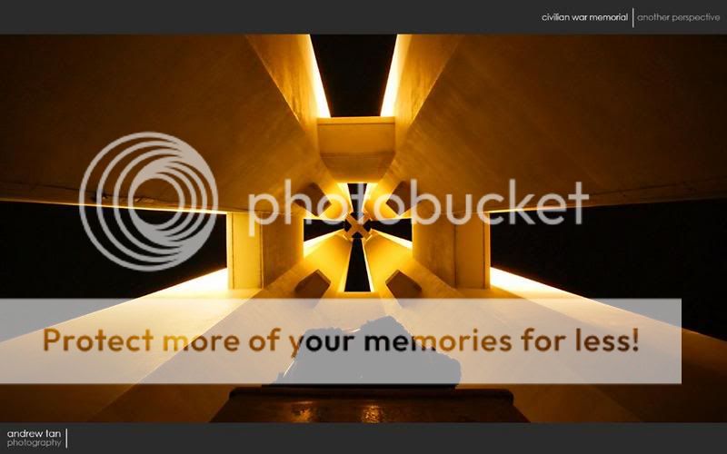
Took this shot lying down with my camera on tripod at 2am in the morning. Just started learning , hope to get some feedbacks.
ISO-800, f/22, exposure time 13sec
 

Nice to know I'm not the only crazy person that likes to walk around in the dead of the night with a camera :bsmilie: Now on to the shot...

Overall, I like the idea of it, the composition is good. It really is a change from the run-of-the-mill shots of this place.

Technical wise, the image seems a little soft, whether it's due to your focusing or f/22 I'm not exactly sure. WB also seems off, I don't recall the lighting to be so warm.
 

good composition.
i'd clone out that thing on the top left column.

the warm lighting looks nice.

any reason for shooting at f22?
 

interesting.. i think the position of the middle part can be improved on. fro mwhat i see its tilted to the left a little.. but its very sutle. so no worries.. you can improve from it

i like the way where u crop it 4:3 scale. with the black borders. give me the movie/hd feel

cheers
 

Have a similar shot in my PC actually, I understand that this is a night shoot and you're limited to what you can do (to hold the camera steady)... I did mine late in the afternoon and positioned the cam directly underneath the center of the memorial, meaning, the cam was on top of that container thing, makes a more balanced shot and not a snap-shot.

If you want to include the centerpiece (bronze thing), i suggest you either fill it with a little flash or paint it with light but include more of the base, right now, the center element is a big distraction to the symmetry of the photo.

Cheers
 

This is good, very different from what is usually posted.

After which it will cease to be "another perspective" because people who have seen this and remember will replicate it too! :bsmilie: Not necessarily on purpose too, mind you.

Nicely done, though yes, there is some slight softness, Me, I suggest some perspective correction to make the verticals and horizontals swee swee, and then introduce vignetting. If you're a purist who is anti-Photoshop, I apologise!
 

Nice to know I'm not the only crazy person that likes to walk around in the dead of the night with a camera :bsmilie: Now on to the shot...

Overall, I like the idea of it, the composition is good. It really is a change from the run-of-the-mill shots of this place.

Technical wise, the image seems a little soft, whether it's due to your focusing or f/22 I'm not exactly sure. WB also seems off, I don't recall the lighting to be so warm.

thanks for the comments, didn't adjust on the white balance, cos haven't explored on that, still reading about it:embrass:
 

good composition.
i'd clone out that thing on the top left column.

the warm lighting looks nice.

any reason for shooting at f22?

thanks, coz didn't want to portray the depth, wanted the elements to be clear throughout. tried a few settings this came out the best i think.
 

interesting.. i think the position of the middle part can be improved on. fro mwhat i see its tilted to the left a little.. but its very sutle. so no worries.. you can improve from it

i like the way where u crop it 4:3 scale. with the black borders. give me the movie/hd feel

cheers

thanks for the compliments. ya, not sure whether is the the centre piece was not squared to the 4 verticals or problem with my alignments. coz can only get either the centre piece squared or the 4 verticals, can't seem to get both squared together... headache... heh..:bsmilie:
 

Have a similar shot in my PC actually, I understand that this is a night shoot and you're limited to what you can do (to hold the camera steady)... I did mine late in the afternoon and positioned the cam directly underneath the center of the memorial, meaning, the cam was on top of that container thing, makes a more balanced shot and not a snap-shot.

If you want to include the centerpiece (bronze thing), i suggest you either fill it with a little flash or paint it with light but include more of the base, right now, the center element is a big distraction to the symmetry of the photo.

Cheers

thanks for the comments, will work on it to improve... cheers!
 

This is good, very different from what is usually posted.

After which it will cease to be "another perspective" because people who have seen this and remember will replicate it too! :bsmilie: Not necessarily on purpose too, mind you.

Nicely done, though yes, there is some slight softness, Me, I suggest some perspective correction to make the verticals and horizontals swee swee, and then introduce vignetting. If you're a purist who is anti-Photoshop, I apologise!

Thanks! have been a fan of your works. yeh, haven't did any corrections to the photo, only cropped it. Never tried correcting photos with photoshop yet, hope to pick up some skill from experienced guys here! :D
 

Thanks! have been a fan of your works. yeh, haven't did any corrections to the photo, only cropped it. Never tried correcting photos with photoshop yet, hope to pick up some skill from experienced guys here! :D

=)

Doesn't seem to need much correction, I did some work on it, here's what came out, let me know if you want me to take it down here.

Rotation of about .7 degrees CW in PS, followed by slight USM (Unsharp Mask).

1051695075_31c65c54fb_o.jpg


Further personal take on manipulation - convert to B&W, up contrast, add vignetting to photo proper:

1051714743_fc6f0ac2cc_o.jpg


You can take it further by adding filters to give your image a slight cast, be it sepia, or yellow, etc.
 

=)

Doesn't seem to need much correction, I did some work on it, here's what came out, let me know if you want me to take it down here.

Rotation of about .7 degrees CW in PS, followed by slight USM (Unsharp Mask).


Further personal take on manipulation - convert to B&W, up contrast, add vignetting to photo proper:


You can take it further by adding filters to give your image a slight cast, be it sepia, or yellow, etc.

background1acopy.jpg


Thanks for the tips, tried to correct the center misalignment and the overall alignments, added vignetting and USM. looks better now... thanks for you help!;)
 

very interesting perspective, thanks for sharing
 

Status
Not open for further replies.