Children of the Past


Status
Not open for further replies.

DeadEnd

New Member
Nov 24, 2006
852
0
0
Ang Mo Kio
www.flickr.com
3216951573_d17d3e9c17_o.jpg


1.in what area is critique to be sought?

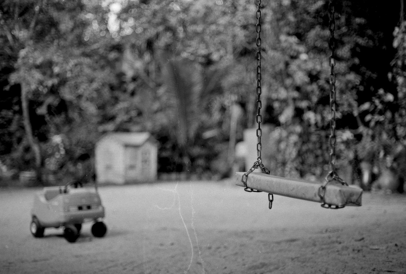
I would like to hear some feedback on the above composition. I have composed my picture to include those simple activities that children in the past had enjoyed. I want to depict the feeling of modernisation has not only changed our way of life but also have an direct impact on the growing up years of our current children.


2.what one hopes to achieve with the piece of work?

By showing the above playground without any children running around using black and white film (the scratch marks on the bottom are unintended, but I decided to leave it as it is as it makes the photo looks old), I want the viewers to feel that the present children are too engross on their latest gadgets (PSP, PS3, Xbox, computers etc) unlike children of the past.


3.under what circumstance is the picture taken? (physical conditions/emotions)

I took this picture because I feel that the current children lack of physical activities, which leads to obesity and the above mentioned gadgets contribute to the growing numbers of myopia cases among the young children (highest among the world for children with myopia).


4.what the critique seeker personally thinks of the picture

I like the above picture as it conveys a message and reminder to all parents that outdoor activities make children healthy and strong through their development years. They should not be too worried that their children will hurt themselves, as it is all part and parcel of growing up. And that is how they have been through the years as well.
 

From your title, I was expecting children donning big, round spectacles and sporting hairstyles that are from the past. So the title does not seem to fit.

Personally, I feel that if the complete swing is in focus, it will deliver a stronger message.

The scratch marks from top to bottom does not work for me too. Unless it occurs on other parts of the photo too.

Pardon me if I did not elaborate on the title "Children of the Past". The pic was to emphasis the activities enjoyed by children of the past taken in present time. And those children of the past do not fit into the playground now due to their age and size :bsmilie:. The deserted playground is to show that children now prefer PSP over a simple swing at the playground.
 

The composition of the picture of a forgotten playground is fine but the bokeh is not very pleasing, especially the central upper parts. The scratch mark looks like water stains to me but it's not disturbing, it adds a bit the feeling of 'picture from old days'.
But the title only works to 50% for me. What is missing is the reference about where the children are today. You explain this nicely in the write-up but if the picture needs such a write-up then the picture has missed that point. Your picture could also work in the context of war where everything is left behind in a hurry (like the toy car in your pic).
Your intended message consists of two parts: past and present. You have captured the past, the present is missing or left to viewers imagination. To fully convey your message I'd add a second picture showing overweighted kids munching junk food while staring at a screen through big glasses - or anything similar.
 

I think this picture has a lot of potential. I like the composition, nothing too dramatic but the image is very meaningful indeed.

I too did not like the bokeh. I'd experiment by blurring totally the background of the swing or make everything sharp. I'd emphasize the swing by making it my main foreground and would make the small bike and that playhouse sharper to give the viewer more details as to what our generation would have played and what the current generation has neglected.
 

OK, message aside, what did not work for me in this picture is the composition. I feel the space is not adequately utilised; all 3 of the elements you seek to portray (swing, toy car and playhouse) are clustered into a mere 1/3 of the total horizontal height.

While this is not always a bad thing, the rest of the space does nothing to contribute to the image. Furthermore, as others have mentioned, the bokeh, not being that smooth and occupying a good portion of the image, tends to distract the viewer and when a viewer is distracted, he most definitely won't be thinking about the message you're trying to portray.

When conveying a message, remember to give attention to the presentation of the message as well, else the message probably will be ignored before it even gets across.

Hope that helps.
 

i do get the feel. not too concern with the bokeh cause either good pp skills or a good lens will do the job.

like the DOF.

you have 3 subject, only thing i find can be better is, i feel the car and house are too close from this angle, if can seperate them better.

may i suggest you pp to "aged" the photo more. like the scratch.
 

there is something very strange with your perspective here. the swing seems larger if not as large as the car and house. it gives a certain 'toy' or 'fantasy' edge to the image which can be an interesting exercise to work on.

as for your intended composition, i'd have preferred having included children playing in it. not every child in Singapore grew/grows up in a big garden, it's personally alien to me since my toddler years was spent in a HDB flat. your image asks that i refer to images and memories derived from TV/movies but not my own. for people like me, it's simpler to relate to your message if we see children at play, rather than not. in this case it's better to provide a simple/direct message that can appeal to anyone instead of a hit or miss depending on who the viewer is. currently unless this image is part of a series it doesn't stand alone well.
 

not a bad composition,

but the swing is not quite standing out as much as it could be, this could be corrected with either - more appropriate black and white conversion to modify the tones,

or keep this method of conversion, and shift yourself such that the tones do not blend into one mess at the top.

to be honest, the depth of field is still too much for me; but you could have been limited by subject/background distance ratio.
 

I think repositioning to get a "longer, more horizontal swing" and keeping the entire length of it in focus will be better.
 

overall the composition seems alright to me, but the swing seems to be the subject, instead of all 3. while its hard to get all 3 in focus (which will just ruin the picture), i think maybe the swing should not be a little smaller then the current size now.. if you know what i mean. cos to me right now, the swing is cryin out for attention, while the playhouse and the ride seems a little.. small.

and the title doesnt really fit.. i think something along the lines of "the forgotten past" or "the abandoned old" or something along those lines, might work better?

just my 2 cents.

overall IMO, is good!
 

the way you frame the picture is nice everything fits perfectly but the toy car in the background didn't work for me. Were you using a very low f stop? Try using a higher f stop. the white lines were horrible, thought you had a scratch on your lens. Hmm overall this picture is great for black and white processing.

I would rate this picture 3 over 5

Just my honest feedback
Cheers:)
 

Status
Not open for further replies.