Ok i know maybe I'm not that qualified to comment much but I think:
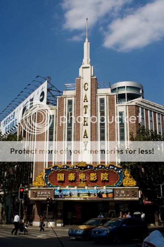
1) Your presentation of the building is much better ( got the important signs, colours and all)
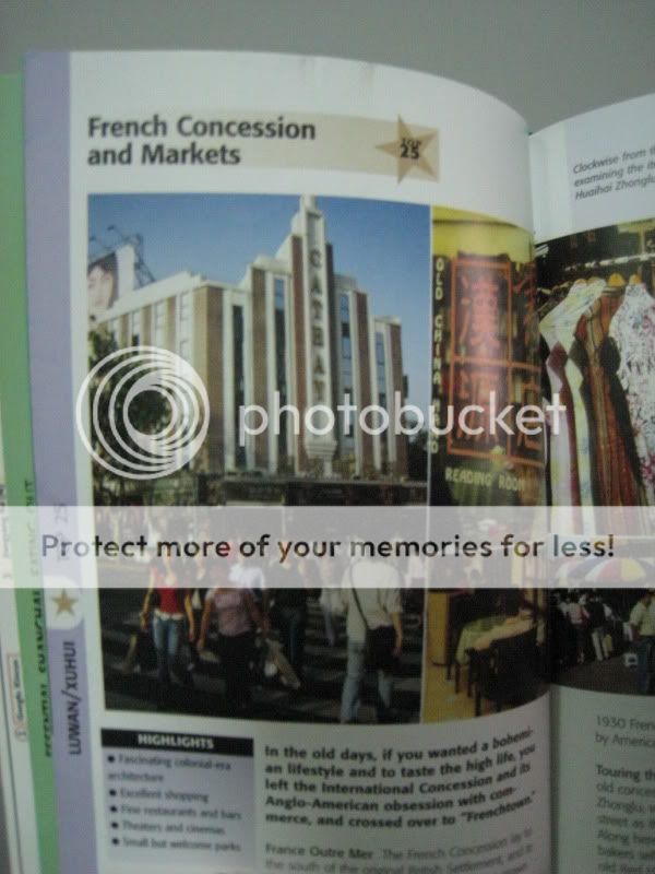
2) However that said, the composition of the scene in the magazine is slightly better, it has background as well as foreground interest. Foreground we can see a bustling crowd of people, and we have the building as a background.
This also depends on what you intend to portrait. A lonely isolated / dilapidated building? A bustling cinema with alot of people? Travel magazines usually have alot of people in their pictures, unless its a picture of the Grand Canyon or something lonely. This will help introduce the country to other foreigners who are interested to see the citizens of the country in question.
Under normal circumstances, I would encourage you to take it again, however since this is shanghai, it probably would be almost impossible unless u return back there.
It's always good to re-take the same scene and subjects with varying angles and time of the day and see how you have improved.
I like the colours of your photo though. Good job on that.
")