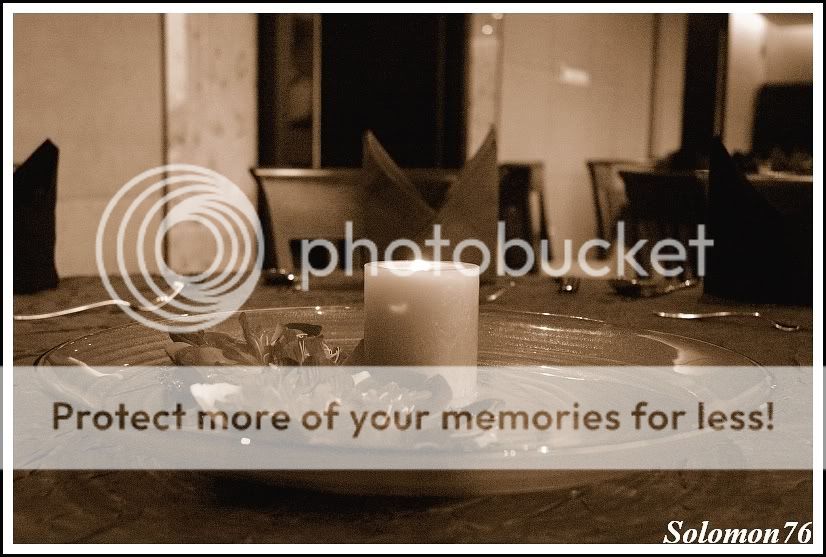
The candle picture looks ok and has that nice feel of concentric circles. However I don't like how the napkin forms "bunny ears" for the candle. Moving to the right a little would eliminate that problem. in addition using less DOF will mean lower iso and a less distracting background. The grain in B&W does not bother me at all.
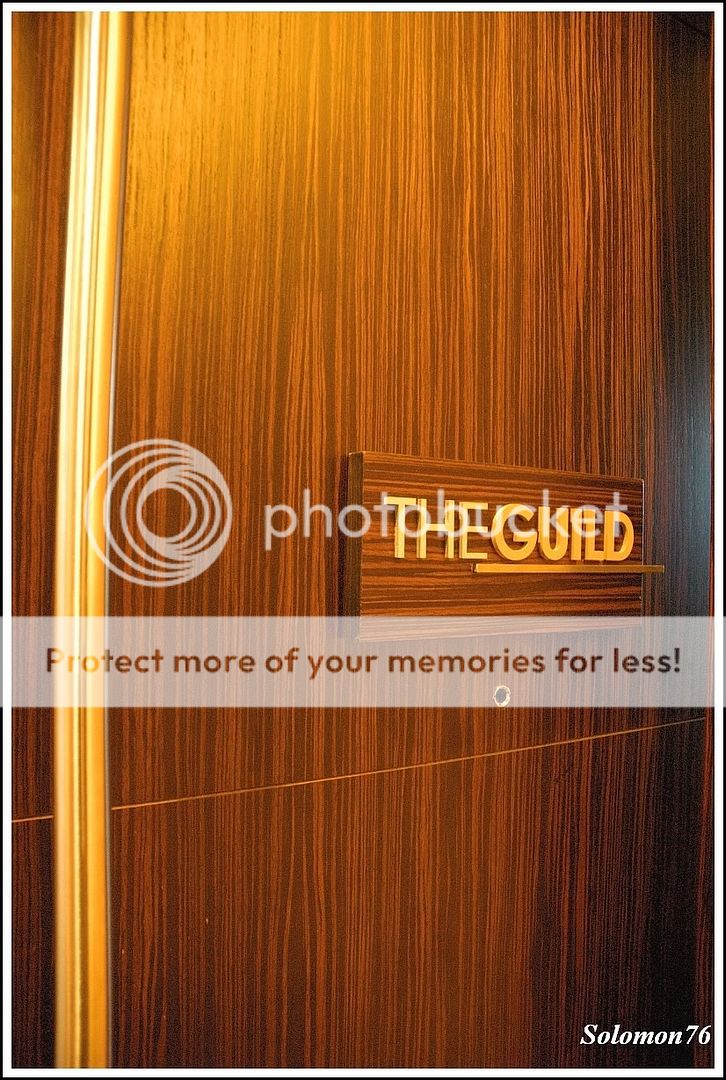
I can see what you are going for in the door picture but I don't think it works. The bright strip of wood on the left of the frame draws your eye away from the focal point of the sign "The Guild". The reflected light on the right of the frame is also distracting. Try a closer crop eliminating the right and left of the frame.

 i took at very high iso