
Cafe leaflet
- Thread starter D70sshooter
- Start date
You are using an out of date browser. It may not display this or other websites correctly.
You should upgrade or use an alternative browser.
You should upgrade or use an alternative browser.
- Status
- Not open for further replies.
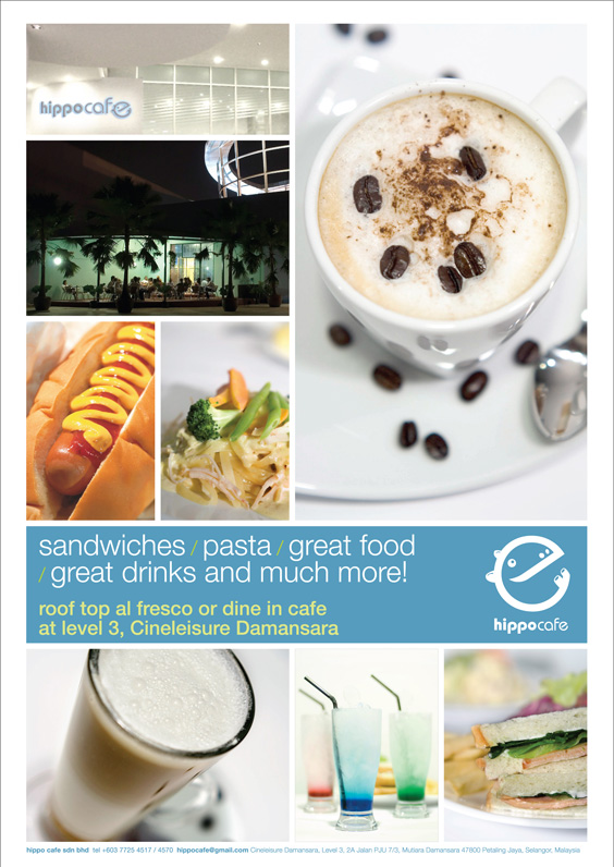
The food and drink pics are alright, but the location pics are a bit too sterile. The one of the cafe at night makes the place look extremely 'ulu' and lonely.
Thanks for your comment. But I can't change the cafe location. :sweat:The food and drink pics are alright, but the location pics are a bit too sterile. The one of the cafe at night makes the place look extremely 'ulu' and lonely.
Ahh... i think you are right. Thanks.too wash out, add some saturation.
oracle0711
Senior Member
The picture of the sandwich is not appealing enough and the pic of the location too (may be an interior shot would be better).
Yah, I am a coffee lover and I like to shoot my coffee....I realised that I need to shot them fast, before the frost bubbles burst....it become very ugly and looks unfresh.....But I like the lighting and angle of the shots of the drinks.:thumbsup: And do you really drink the coffee with the beans in the drink?
Overall its nice... but the froth on the coffee is a major turnoff.
Yah, I am a coffee lover and I like to shoot my coffee....I realised that I need to shot them fast, before the frost bubbles burst....it become very ugly and looks unfresh.....But I like the lighting and angle of the shots of the drinks.:thumbsup: And do you really drink the coffee with the beans in the drink?
yes. have to take very fast before the bubbles burst or the foam become flat.
As for the beans... nope we don't drink with the beans in the it.
I actually did some research before shoot this and find quite a few also shoot like this so i too just try it out. And they choose this to be in the leaflet.
thanks for all the comments. really helpful for me as i first time shoot food & drink photography. :thumbsup:
the pic on e top left "hippocafe".. i think u could have zoomed in more on that.
night pic looks too dark n uninteresting.
the text content is abit too boring n cliche.. =/
hehe. =X
night pic looks too dark n uninteresting.
the text content is abit too boring n cliche.. =/
hehe. =X
Got to comment on the logo, its nicely done, especillay the "e" which make to look like a hippo. Girsl will goes "Kawayiiii..." when they see it ")
Did you do the whole branding for this cafe?
Did you do the whole branding for this cafe?
Did you do the whole branding for this cafe?
yeah.. like the hippo too.
husband and wife team.. i do the shooting, my wife do the branding design and layout of this leaflet.
u not scare ppl steal ur idea... ???
uhh..emm... ehh.....:sweat:
what to do... small set up only... if people really want to copy it can't stop it. :cry:
I'm just going to rattle off my thoughts, hope you dont mind.
I feel there's too much white in the leaflet. Is that what you want?
If you are going to pay someone else to print the leaflets for you, and paying for a colour version in this case, maybe should include more colourful pictures or up the saturation of the drinks pic at least . The salad has too much white in it too, imho. Try to capture more green and red bits and less of the salad dressing.
The hotdog pic is the only one which has some colour in it to give the leaflet more punch.
The hotdog pic however does not blend in well with the rest of the pics as its more warm toned. Whereas the other pics, except for the night pic, are cool toned. It looks like you are going for an overall pastel colour and kawaii theme for this leaflet. Maybe a pic of icecream (pinks and yellows) can come in useful as well, assuming you have icecream on your menu.
But then, a pastel kawaii theme leaflet is only good if your target customers are mostly young ladies Think about it.
And I cant seem to find your outlet's opening hours, business days and telephone number.
Hope this helps, otherwise just ignore my ramblings
I feel there's too much white in the leaflet. Is that what you want?
If you are going to pay someone else to print the leaflets for you, and paying for a colour version in this case, maybe should include more colourful pictures or up the saturation of the drinks pic at least . The salad has too much white in it too, imho. Try to capture more green and red bits and less of the salad dressing.
The hotdog pic is the only one which has some colour in it to give the leaflet more punch.
The hotdog pic however does not blend in well with the rest of the pics as its more warm toned. Whereas the other pics, except for the night pic, are cool toned. It looks like you are going for an overall pastel colour and kawaii theme for this leaflet. Maybe a pic of icecream (pinks and yellows) can come in useful as well, assuming you have icecream on your menu.
But then, a pastel kawaii theme leaflet is only good if your target customers are mostly young ladies
Think about it.And I cant seem to find your outlet's opening hours, business days and telephone number.
Hope this helps, otherwise just ignore my ramblings
:thumbsup:I'm just going to rattle off my thoughts, hope you dont mind.
I feel there's too much white in the leaflet. Is that what you want?
If you are going to pay someone else to print the leaflets for you, and paying for a colour version in this case, maybe should include more colourful pictures or up the saturation of the drinks pic at least . The salad has too much white in it too, imho. Try to capture more green and red bits and less of the salad dressing.
The hotdog pic is the only one which has some colour in it to give the leaflet more punch.
The hotdog pic however does not blend in well with the rest of the pics as its more warm toned. Whereas the other pics, except for the night pic, are cool toned. It looks like you are going for an overall pastel colour and kawaii theme for this leaflet. Maybe a pic of icecream (pinks and yellows) can come in useful as well, assuming you have icecream on your menu.
But then, a pastel kawaii theme leaflet is only good if your target customers are mostly young ladies
And I cant seem to find your outlet's opening hours, business days and telephone number.
Hope this helps, otherwise just ignore my ramblings
Thanks a lot on your comments. Great help.
Will take note and do better next time.
- Status
- Not open for further replies.
Similar threads
- Replies
- 0
- Views
- 26
- Replies
- 0
- Views
- 48
- Replies
- 0
- Views
- 58
- Replies
- 0
- Views
- 80