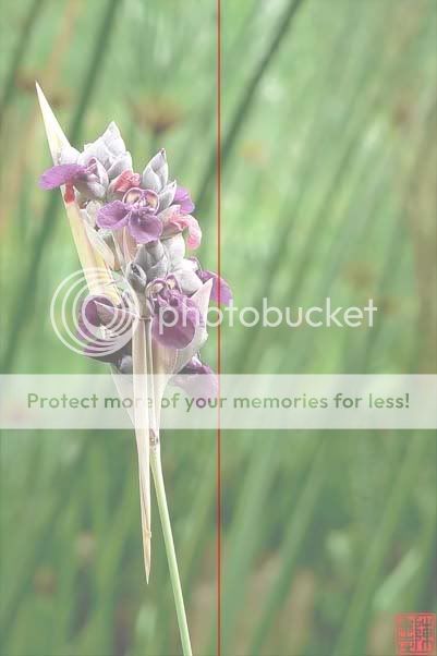
the composition is particularly problematic as it cuts the frame into 2 equal halves, the right half looking rather empty.
signatures might be something of personal preference but i think black or white signatures with lower opacity works better than brightly coloured ones that try to compete with the subject for attention.
diagonally across would be interesting... but problem is i still dun get the idea what is that... i see flowers but its not in its entirety. using this angle, the subject just look very flat.