
Bare Branches
- Thread starter SilverStallion
- Start date
You are using an out of date browser. It may not display this or other websites correctly.
You should upgrade or use an alternative browser.
You should upgrade or use an alternative browser.
- Status
- Not open for further replies.
")
Grub said:Really nice, how did you get the sky so blue? Was this in Singapore at all?
Lol... nope. I'm in Perth now. It's taken at Murdoch University Hostel. Singapore rarely can get such clear sky.
Before I give my comments, posters and critics alike please read the guidelines for Critique Corner (CC): http://forums.clubsnap.org/showthread.php?t=139941
And the outcry by some in the CS community on the standard of CC nowadays:
http://forums.clubsnap.org/showthread.php?t=178245
Hope we all as a community can adhere to the guidelines set down by the admins and moderators.
Now the formal stuff out of the way...
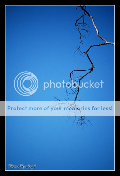
Aesthetically the photo is pleasing, with no distractions and a clear subject. However, doesn't really make a impressionable statement to me, since it's just a pretty ordinary branch in clear blue sky.
And the outcry by some in the CS community on the standard of CC nowadays:
http://forums.clubsnap.org/showthread.php?t=178245
Hope we all as a community can adhere to the guidelines set down by the admins and moderators.
Now the formal stuff out of the way...
Aesthetically the photo is pleasing, with no distractions and a clear subject. However, doesn't really make a impressionable statement to me, since it's just a pretty ordinary branch in clear blue sky.
http://forums.clubsnap.org/showpost.php?p=1385865&postcount=1 is a must read
back to the picture(s), #1 is pleasing and clearly the branch is the subject but I'll prefer the focus to be on a part of the branch. Your border seems to crop away part of the upper branches, if the branch ends there it'll be good to leave it in. ie I could see 2 ends of the branch in the pic.
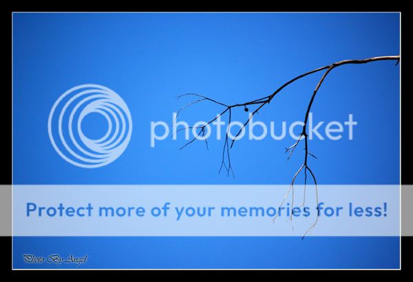
as for #2, the little branch at the extreme right is a little distracting. would be advisable to crop it off. some sky gradient could be done in PP to achieve a better effect.
back to the picture(s), #1 is pleasing and clearly the branch is the subject but I'll prefer the focus to be on a part of the branch. Your border seems to crop away part of the upper branches, if the branch ends there it'll be good to leave it in. ie I could see 2 ends of the branch in the pic.
as for #2, the little branch at the extreme right is a little distracting. would be advisable to crop it off. some sky gradient could be done in PP to achieve a better effect.
The branch looks lonely... especially the second one.
But I like the blue sky though. Have been trying to shot blue blue sky, but couldn't find it.
But I like the blue sky though. Have been trying to shot blue blue sky, but couldn't find it.
It's a good effort trying to make something out of a mundane thing such as a branch. Well thought out. :thumbsup:
first of all beautiful tones :thumbsup:
for #1, imho you should crop away more of the top so that the attention is naturally focussed on the main branch
#2, i think a portrait format (rotate 90 degree clockwise) works better for me.
for #1, imho you should crop away more of the top so that the attention is naturally focussed on the main branch
#2, i think a portrait format (rotate 90 degree clockwise) works better for me.
Hey, this look like a chinese painting, especially the first #1!
If you see chinese painting you will know what I meant. What you need is some chinese poem written on the left from top down.
Ah,.. yes, still need some cropping make the branch move closer to the left and lower a bit.
If you see chinese painting you will know what I meant. What you need is some chinese poem written on the left from top down.
Ah,.. yes, still need some cropping make the branch move closer to the left and lower a bit.
#1 is very good I like that, but not for #2. Maybe the branches for #2 is not that attractive.
btw, are you a very quiet person? because I am trying to understand people thru their photography :bsmilie:
btw, are you a very quiet person? because I am trying to understand people thru their photography :bsmilie:
vincenthau said:#1 is very good I like that, but not for #2. Maybe the branches for #2 is not that attractive.
btw, are you a very quiet person? because I am trying to understand people thru their photography :bsmilie:
Hey guys, thanks for the comment. Yes, now i do think that the #1 should crop more. as for no #2, maybe not as attractive, but it does look like a pair of super skinny hands.
vincenthau: actually not really. I'm a very out going and noisy kind of girl. but very homely, and I love nature.
- Status
- Not open for further replies.
Similar threads
- Replies
- 0
- Views
- 71
- Replies
- 0
- Views
- 45
- Replies
- 0
- Views
- 37
- Replies
- 0
- Views
- 46