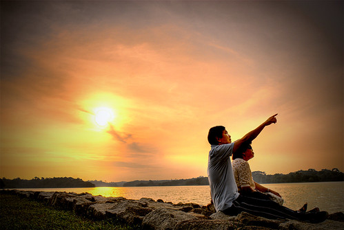
I like the image very much. I think it captures drama and mood. Your introduction was definitely a plus for my appreciation of the total shot. I think the vignette is a very nice touch. Your lighting on the couple is a nice touch. I've never been big on silouttes--they remind me of the many accidentally underexposed accidents from my beginnings. I consider them globs of black against a lighter background that describe pretty much nothing.
Then you fail to fulfill the potential of silhouettes. Writing them off as what you do is pretty narrowminded and naive if you ask me. Silhouettes can be used to tell stories, or give a different feel. Who says every single subject in a photo needs to be well exposed 100% of the time?
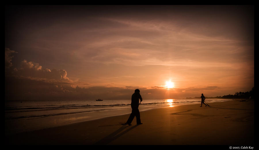
and
are good examples of how silhouettes can still tell a story even though the subject is not fully lit or well exposed. Sorry if I am going too off-topic. Threadstarter, let me know, likewise, if you want these examples taken down.
 And I do agree that it's oversharpened, but just a tad.