An Officer


Status
Not open for further replies.

HotSpots

New Member
May 19, 2004
244
0
0
52
Tanjong Pagar
photobucket.com
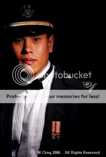
Here's a shot of a friend who was just recently promoted to Warrant Officer.

Taken with a single studio light with snoot on black bg. I wanted to capture an aura of awe and authority and thus used such a harsh single light source.

On hindsight, I should've slightly lighted the contours of the hat.

Comments & criticisms welcome!

Officer.jpg
 

works for me :thumbsup: but agree with you too that the contours of the hat should be lighted/ highlighted. the hat is key to imposing an authoritative figure. only nagging detail is his dress shirt - perhaps that could have been straightened? looks kinda sloppy... sorry...
 

Is that supposed how that uniform is supposed to be worn? looks very snap fit to me and lacks any indication of authority. Might be a bit offensive but my first thoughts was "army cosplay?" until I read your write up.
 

Insufficient contrast. Background should not be in black as it merge into the hat and suit.
 

Thanks for all the feedback :thumbsup:

He's wearing the Air Force's No. 2 attire...I think it's on loan and not tailored and thus, not very fitting....but this is not an excuse for not straightening his shirt. :embrass:

This is an experimental shot...I have all the other standard well-lit shots showing everything as well but wanted to post this for feedback. I intentionally wanted the uniform to disappear into the background, leaving only his rank and decoration medals.
 

I have no issue with the lighting. However, I find the composition a bit lop sided. I can understand the need to show the ampulet, but his right side could use a little space.
 

unable to see the effect of snoot lighting on b/g. otherwise, it could be much better.
 

reachme2003 said:
unable to see the effect of snoot lighting on b/g. otherwise, it could be much better.

Sorry...I meant single snoot on the subject, who's standing in front of a black bg. Not the snoot on the bg. :embrass:
 

tOGGY said:
Insufficient contrast. Background should not be in black as it merge into the hat and suit.
Perhaps a rim lighting would help to outline the shoulder and hat.
 

Status
Not open for further replies.