Abhaya Mudra


ZenoWai09

New Member
Jan 2, 2010
30
0
0
Singapore
www.flickr.com
4348992656_7cef9cdfa8.jpg


1. in what area is critique to be sought?
framing, exposure, etc

2. what one hopes to achieve with the piece of work?
learning experience

3. under what circumstance is the picture taken? (physical conditions/emotions)
I went to this Buddhist temple at Toa Payoh and saw this graceful Buddha image.

4. what the critique seeker personally thinks of the picture
one of my best.
 

Hello, ZenoWai09.
Allow me to share with you several points.

Exposure
- good. Nothing to criticize on.

Framing/Composition

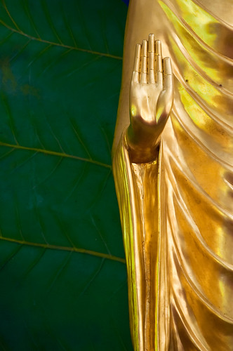
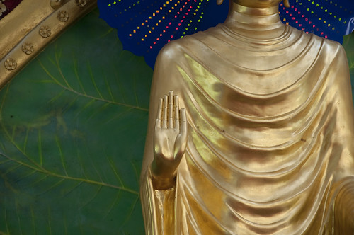
Abhaya mudra - the hand sign of protection.
I think what you are trying to do is to portray this powerful gesture and to convey this feeling to the viewers.
It is good to have some green background to the right side of the Buddha. But limit that, otherwise it becomes more of a distraction.
I would suggest leaving only a small slither of the green background on the left.

The rest of the Buddha's body serves also as distraction. I would suggest cropping out until the hand occupies the top half, and left half of the frame.
By doing so, the viewer's attention would certainly be drawn just to the hand.

Further

I added this in as an afterthought, as I kept thinking about how to make this shot better.
It dawns upon me that one reason is also because it looks a little too flat as you have shot it full frontal view.
May I suggest going at it from an oblique angle. Use a slightly wider aperture and take the hand at an angle from the side so that the background becomes out of focussed.
This would isolate your subject (here, the hand) from the background much more effectively, and the angle would give it more depth.

As usual, these are but my humble opinion.
Keep practising and keep your photos coming! ;)
 

Last edited:
try with a different angle.

head on shot like that only gives me the impression that this is a snap shot that went "wrong".

if going by the rule of third... your photo had failed.
 

The exposure and framing is fine. Really, there is nothing wrong here.

I can see that you want to make it look more graphic by shooting it with a long lens(which is a right choice) and with a straight-on perspective. Lines, shapes and colors(only 2 colors which is good) are all in place. The hand is at the right place as well; It is placed along the diagonal line.

The left hand side and the bottom is a bit spacious, can be cropped a little bit tightly. So that the image split into half, one side 'green' and another side 'yellow'. Since this is a 3:2 framing, just use back the same framing when u activate the cropping tool, and just slide the new frame diagonally to see how much balance u want.

But it is just a personal preference afterall. I think it will look good as a book cover if left uncropped. :thumbsup:
 

johnlim, sinned79 and limwhow...

thank you so much for your valuable time and inputs...

your opinions really help me a lot to make a better judgment in future.


special thanks to limwhow who goes all the way to find the meaning of Abhaya Mudra. :)
 

ha ha its CNY and feasting and other such activities have likely kept many busy with other things ..... so dont feel left out brother.

I like this piece of work for its design and symmertrical elements portrayed (a variation of the ying/yang concept?)

Do you have a version that does the same as above BUT with the hand dominating one half ?

:thumbsup:
 

hi ed9119, thank you for your kind words. hopefully more ppl will feedback in my next critique post. :)

sorry brother, i don't have the one u requested.. sorry for that.. :(
 

ZenoWai09, I am quite sure you have other shots of the same subject from various perspectives, don't you?
Perhaps if you don't mind sharing with us? I actually am interested to see maybe another couple of shots you have.
Of course, this being a critique section, you would certainly need the green light from the Mods here before you can post it up.
 

Thanks so much for sharing with us your other photos, ZenoWai09.
Yes, they are a little cluttered.
Keep things simple and it will work great.

For subjects like these, I personally just like to go all close up and keep it clean and simple.
I am partial to photos with differential focussing, i.e. subject sharp, background out of focus.
Maybe that is just my style, hahaha...

But keep practising, ZenoWai09!
 

Last edited:
With the additional picture...I think you had already done your best.

Bcoz of your title, others might have be taken aback but not...limwhow.

The additional pictures give us a much clearer picture of how the physical condition of this picture was taken and will be much more reserve in our crit. Food for thought maybe ?

Hahaha...cabbySHE.
No lah... I am open to anything in the title one lah :bsmilie:.
And you know something, cabbySHE?
Now that you have pointed me in that direction, I began to examine the physical location of the TS's shot and I conclude that whatever I have said earlier about 'going at it from an angle...' lah, getting a shallow DOF lah... all that, may be a little difficult to attain here in this case.

If ZenoWai09 were to attempt an angled shot, he would:

  • need to move very close up front
  • use a telezoom lens with a longer focal length... say, maybe even 200mm to go close up to the hand
And sure, if the aperture is wide enough, say f/2.8, then he can throw the background off in a blur... but the multitudes of colours of the wall murals may not be that ideal nor clean a background to give a good bokeh.

Well, then again, it is so very interesting that in life, often times what hit us in the face have other mitigating/contributing factors and causes... and things aren't just a simple as what they appear on face value.
A reminder for me. Thank you very much, cabbySHE, for enilghtening ;)!
 

Hi limwhow, in fact it was good for you to ask TS to post more pictures of the surroundings.
We all had a much clearer view of what condition he is in. Especially in any religious buildings, once I am inside, always give priority to respect those that are with that religion.
Though, sometimes might have spotted some interesting angle or composition but with due respect, always seek permission first from whoever in charge.
Really hate to see anyone photographers, whether they are new, young, experienced, pro, started to climb or stand on something which might be considered sacred for that religion, and therby give photographers a bad name.

Notice that more and more " no photography " signage are being put up in more buildings nowadays.
 

can try crop 2:1 format? less of the green than the one tried edit here i think should be better. pls let me know if u want me to remove it.

4348992656_7cef9cdfa8.jpg
 

Last edited:
can try crop 2:1 format? less of the green than the one tried edit here i think should be better. pls let me know if u want me to remove it.

4348992656_7cef9cdfa8.jpg

Hello, denniskee.
After you have done the crop and added in the selective blur, it definitely looks much better.
I think post processing-wise, the effect has been really maximised already.

It is just me, my preference is more that of a 2:3 ratio.
 

This is a sign of protection and a powerful gesture, as mentioned by limwhow.
So I reckon, the size of the palm should be dominating, not as here, just a small portion.

If a traffic police show this sign, it means all vehicles had to stop. Powerful gesture right ?