
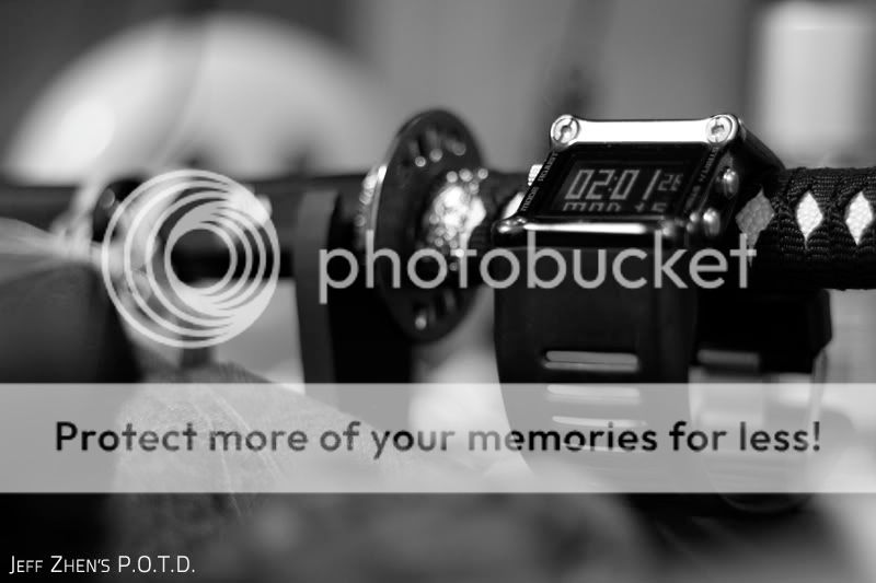
Hi everyone, new guy here. I took this photo, amongst many others, in the midst of the night after finishing my work, and I really love this shot.
1. in what area is critique to be sought?
I think what I really seek is how to improve the contrast, by playing with lighting, using the camera, or external sources. Also about more technical know how on external camera filters, to improve these kinda of monochromatic shots.
2. what one hopes to achieve with the piece of work?
I call this photo "A moment please..." it wasn't planned or anything, I just thought it reflected how I felt during the time I took the photo.
3. under what circumstance is the picture taken? (physical conditions/emotions)
Physical conditions - fluorescent lighting in my tiny bedroom.
Camera conditions - Canon eos 550D, F1.8, 1/25, ISO 1600, 50mm prime lense.
4. what the critique seeker personally thinks of the picture
This was taken at 2am after finishing my work, so I was just trying to take a breather before going to bed. So it kind of reflects on how, after a long hard day's work, you try to find a moment for yourself, and I guess this was it.

")