RSSNewsFeeder
Member
Nobody likes rules. Ok, well some people like rules. Your old school principal? He liked rules. So does that scary lady in the HR department. When it comes to composition in photography, I don’t like to talk in terms of rules; I prefer instead to talk about composition “ideas”.
Some of the ideas presented in this article have been around for millennia and have been used in art and architecture by some of the most famous names in history.
Here’s the thing about these ideas; they constantly contradict each other. And that’s ok. No one idea presented here is “better” than another. They can be used on their own, combined, or completely disregarded depending on what you are trying to achieve in your photograph. You won’t get sent to the principal’s office for ignoring them. I promise. After all, there is more than one way to cook an egg. Poached egg is obviously the best way though, and I’ll fight anyone who says otherwise.
Time for an Update
The last time I wrote an article on composition here back in 2016, you should have seen some of the messages I received. Wow. One guy (anonymously of course) sent me a message containing the following charming message: “Hey a**hole. Did Leonardo Da Vinci use any of these ‘rules’? Did Monet? F*** you for s***ing on the arts”. So yeah; composition is a topic that tends to get some people quite upset for some reason.
Aside from the fact that did the two aforementioned artists did in fact use some of these composition techniques, I am not for one moment suggesting that what follows must be followed without question. In fact, I mention how I find some of the ideas a bit daft. They do however provide a collection of tools that you can use to arrange the elements in your frame in an interesting manner to create photographs with impact. But….. feel free to ignore them when you think that’s what will work for the photograph you are creating. Sometimes, doing the unexpected can lead to great things.
The last article I wrote on composition ended up being the 5th most popular article of the decade here, much to my surprise! I’ve decided to update that article with extra composition ideas and new photo examples. For each idea, I will give a brief description of what it’s all about followed by a few examples of the idea in action. Complaints, insults, and threats of bodily harm can be mailed to me on the back of a 50 Dollar/Euro/Pound note.
#1. The Rule of Thirds
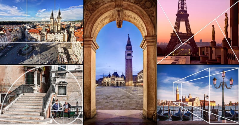
So I’ve just gone on a rant about how this article does not contain a list of “rules” for composition. I then go and start with something called the “rule of thirds”. Hey, I didn’t come up with the name. When using the rule of thirds for composition, we divide the frame into a grid of 9 equal rectangles. Then, we try to place important elements in the scene like the main subject, or the horizon for example, along one of these lines. We can also try to place something of interest where two of the lines cross each other. We often have a natural urge to place our subject in the dead center of the frame when often putting it to one side using the rule of thirds can result in a more pleasing composition.
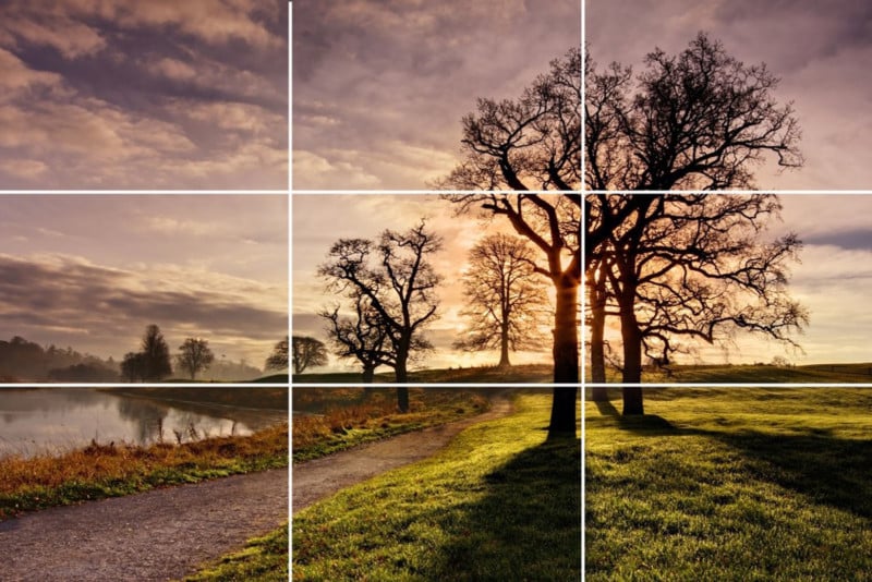
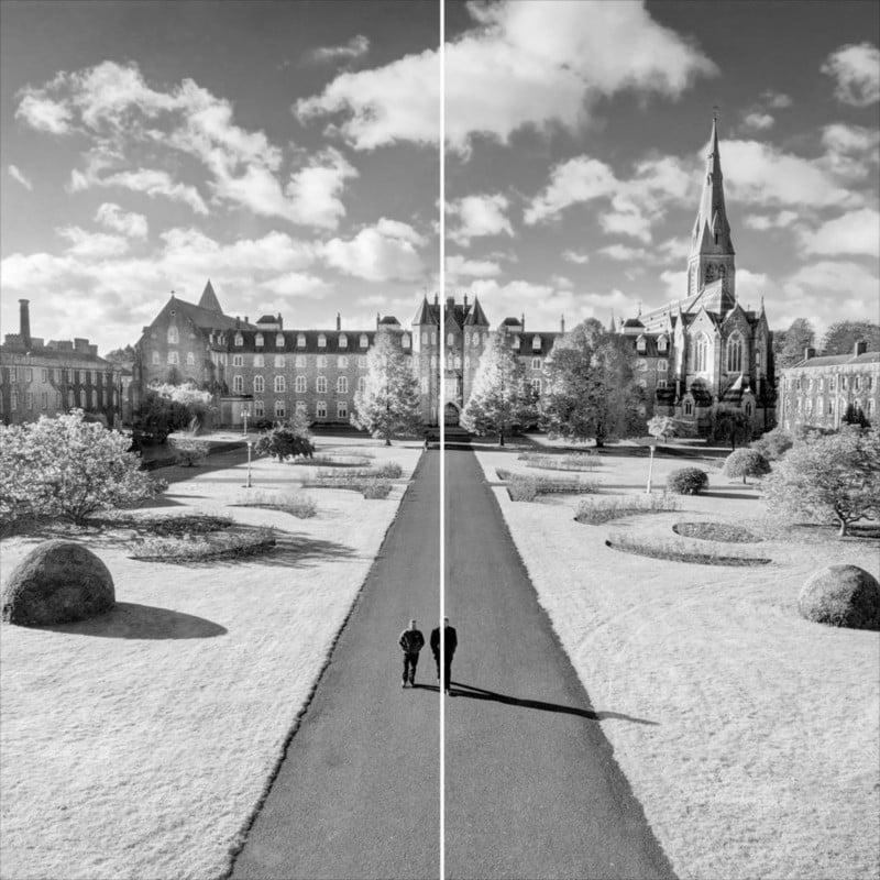
Maynooth, County Kildare, Ireland
In this case, the horizon sits roughly on the bottom third line while the closest tree sits along the horizontal third line to the right.
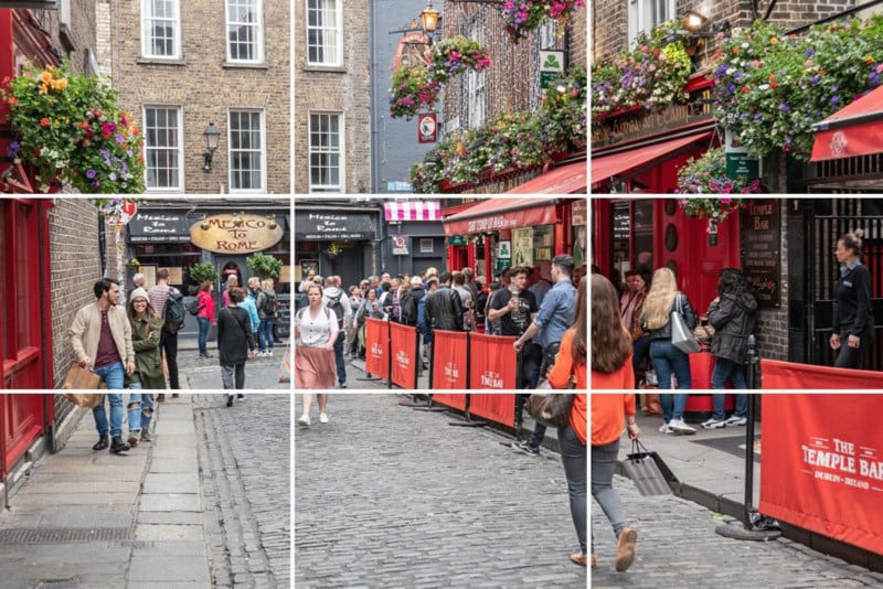
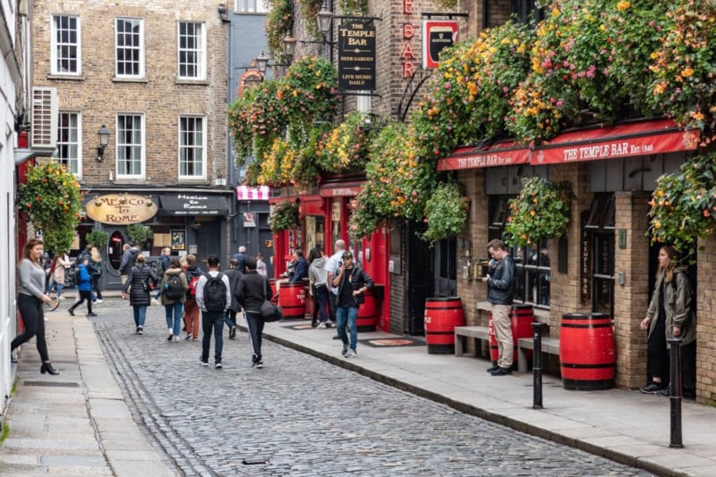
Temple Bar, Dublin, Ireland
In this street photograph taken in my home city of Dublin, I’ve placed the woman in red walking along the street on the point where two of the grid lines intersect. The cobbled street roughly occupies the bottom third of the frame; the building ground floors frontages occupy the middle third and the upper floors of the buildings occupy the top third. Having the rule of thirds grid activated in live view on my camera really helped me with composition when I took this photograph.
#2. Centered Composition / Symmetry
So I’ve just told you that often, using a completely centered composition is not always the best option. Now of course I’m going to suggest that you do the complete opposite. I did tell you that these ideas often contradict each other. Some scenes call out for a centered composition, especially when there is symmetry in the scene.
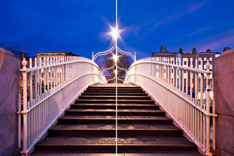
Ha’penny Bridge, Dublin, Ireland
Architecture and engineering often make ideal subjects for centered composition. This view of the Ha’penny Bridge in Dublin is a perfect example of this.
Maynooth University, Ireland
Square cropped frames can be a suitable option for centered compositions. A square is completely symmetrical after all. I actually studied French and history at this university over twenty years ago. I had very little time for photography though as I was just so busy drinking beer discussing eighteenth-century French poetry and the merits of enlightened absolutism in Prussia with my fellow scholars.
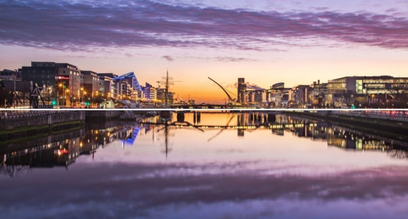
Dublin Docklands, Ireland
Symmetry doesn’t always have to be vertical in nature. Reflections can create the perfect opportunity to capture some horizontal symmetry. Early morning and evening times often present good opportunities for reflections like this as the air cools and the wind drops.
#3. Golden Triangles
The golden triangles method of composition works in a very similar way to the rule of thirds. Instead of horizontal and vertical lines, we use a series of diagonal lines to divide up the frame. We draw one line from one corner to another and then add two more lines from the other corners that meet the long diagonal at a right angle. Later on, we will see how diagonals can be a particularly powerful composition tool. Diagonals are said to add “dynamic tension” to the composition. More on this later.
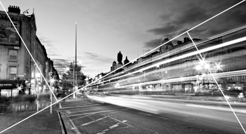
O’Connell Street, Dublin
Notice how the traffic trails and top of the buildings roughly line up with the long diagonal line. The tops of the buildings are close to the shorter diagonal. The rule of thirds and golden triangles are guides for arranging the elements in the frame. They don’t have to be exact. Note that the long diagonal could also start in the top left corner and go to the bottom right depending on the scene.
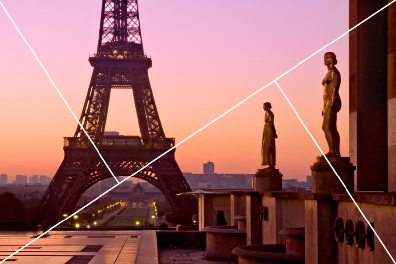
The Eiffel Tower, Paris
In this photograph, the use of the golden triangles method of composition is more subtle. There is an implied diagonal going along the top of the heads on the statues towards the bottom left-hand corner. This is something that we see frequently when it comes to composition. Often the lines that link the various elements in the frame are implied rather than explicit.
I took this photograph at about 6am. I was alone apart from an inebriated Parisian who would randomly wander into the frame every so often. By the time I was ready to leave, he seemed to be engaged in an animated argument with one of the statues. Judging by his condition, I think the statue probably won.
#4. The Golden Ratio
The golden ratio composition technique is one that has resulted in much heated discussion when I’ve written about it in previous articles. In reality, though, it’s actually quite simple: two quantities are in the golden ratio if their ratio is the same as the ratio of their sum to the larger of the two quantities. See. Easy. Ok then, maybe that was a bit over-complicated. How about I explain it using a mathematical formula.
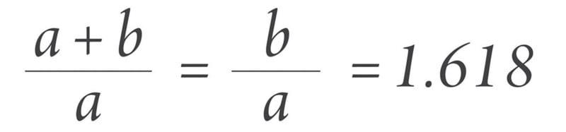
Ok, that seems to have just made things worse. Forget all that. I often describe the golden ratio as being a slightly more complicated version of the rule of thirds with a little bit of the golden triangles method thrown into the mix. Take a look at the image below.
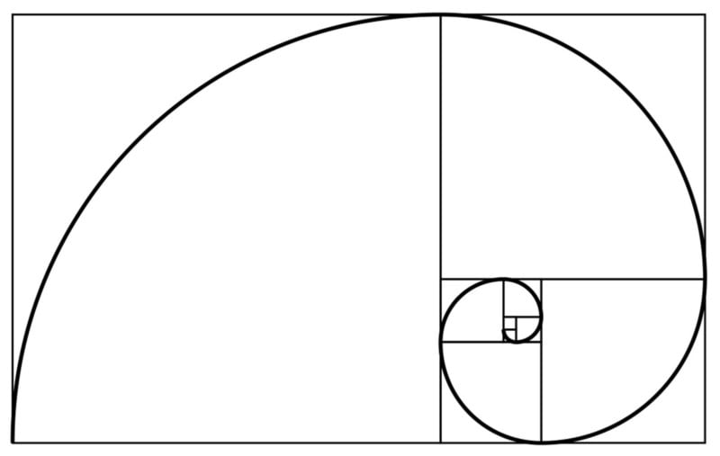
The Golden Ratio / Phi Grid / Fibonacci Spiral | Adobe Stock
Rather than dividing the frame into equal rectangles, it is instead divided into a series of squares as in the example above. This is known as a “Phi Grid”. These squares are then used as a guide to add a spiral known as the “Fibonacci Spiral”. These squares, lines, and spiral are then used to lay out the elements in the frame as with the rule of thirds and golden triangles. The spiral is supposed to lead the eye around the frame and show us how the scene should flow. It’s a bit like an invisible leading line. We will look at leading lines in more detail shortly.
Adobe Stock
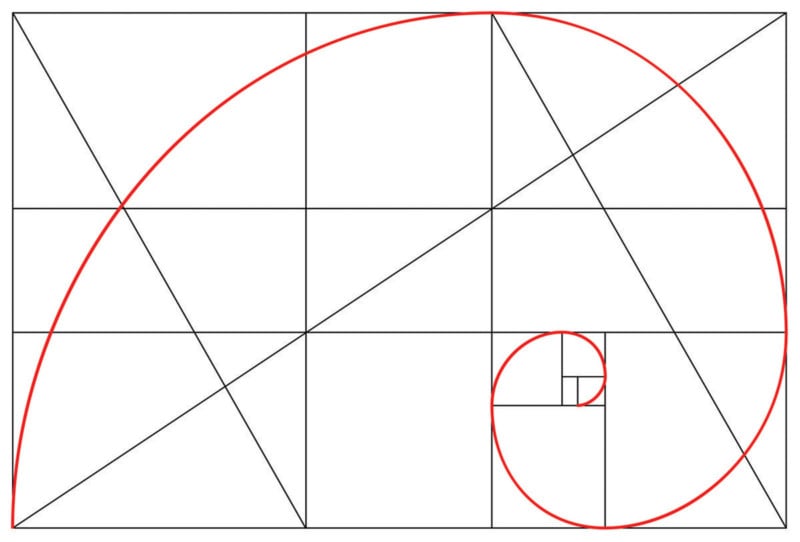
The similarities with the rule of thirds and golden triangles become clearer once we add a few lines to the diagram. The golden ratio also divides the frame into 9 parts although this time they are not all the same size and shape. The diagonals we saw in the golden triangles examples can also be added here.
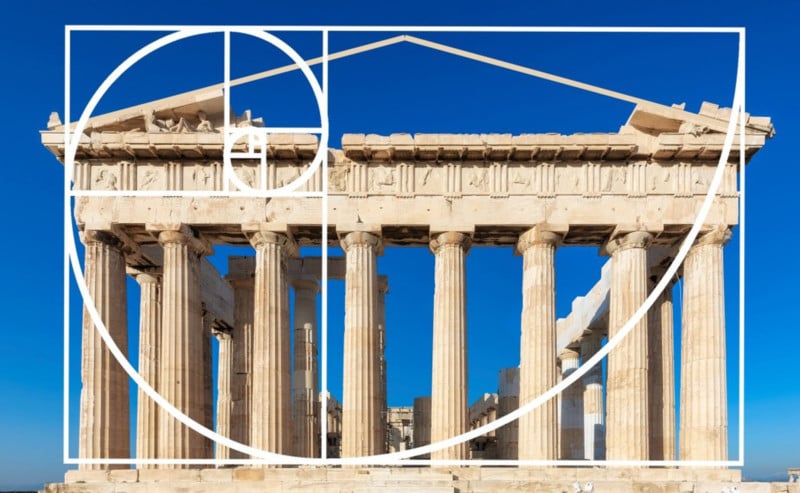
The Parthenon, Athens | Adobe Stock
It is believed that this method of composition has been in existence for over 2,400 years having been devised by the Ancient Greeks. The golden ratio was widely used throughout history in many types of art as well as architecture as a way of creating aesthetically pleasing compositions. It was particularly well employed in Renaissance art.
I Meant It… I Swear.
Before I show some examples of the golden ratio in action, I have to admit something. Not once have I ever set out to use the golden ratio in one of my compositions. However, I decided to have a look back through my photographs and see if there were any in which I had accidentally inadvertently used the golden ratio. It turns out there were. In reality, I was probably thinking of the rule of thirds or golden triangles and accidentally stumbled upon the golden ratio.
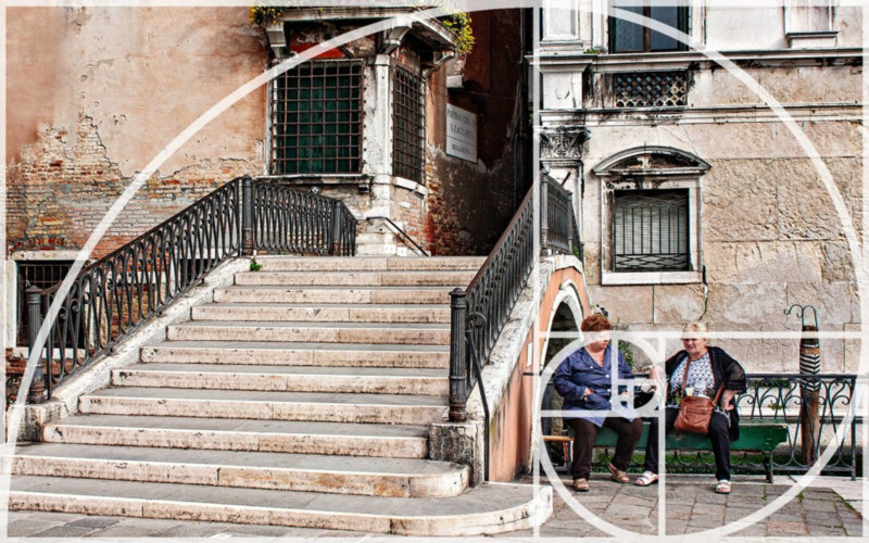
Venice, Italy
Here is a perfect example of one of my accidental uses of the golden ratio. The side of the building lines up with the vertical line on the right and the Fibonacci Spiral leads us from the bottom left corner to the two women sitting by one of the many bridges that traverse the canals of Venice.
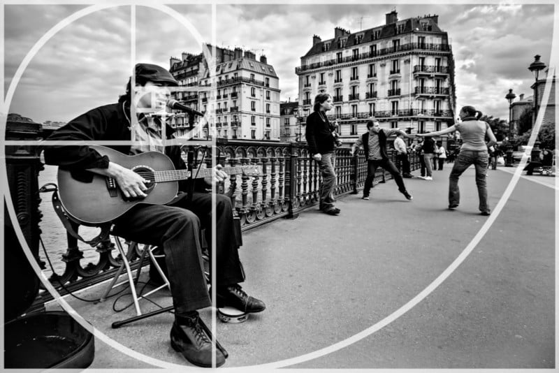
Paris, France
In this case, the Fibonacci Spiral starts in the top right-hand corner, passes under the couple dancing and finishes on the street musician’s face. The fact that I accidentally stumbled upon the golden ratio a few times shows how many of these composition “rules” may actually be manifestations of our internal aesthetic preferences that come naturally to us. Woah. Deep. It reminds us that these should be used as ideas and not strict rules.
#5. Balancing the Elements in the Frame
In this section, I’m going to discuss a composition tool that aims to address one of the issues that sometimes crops up when we use the rule of thirds. When we place the main subject on one side of the frame, it can sometimes make the composition seem a little unbalanced. One side of the frame has a point of interest while there is not much happening on the other side. The photo can appear a little lop-sided. A way of remedying this is to include a less prominent element on the other side of the frame to balance things up a little.
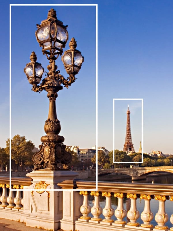
Pont des Arts, Paris
In this photograph, the ornate streetlamp dominates the left-hand side of the frame. This is balanced by the Eiffel Tower off in the distance which appears smaller in the frame.
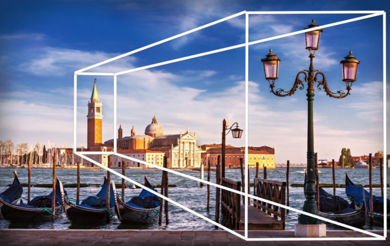
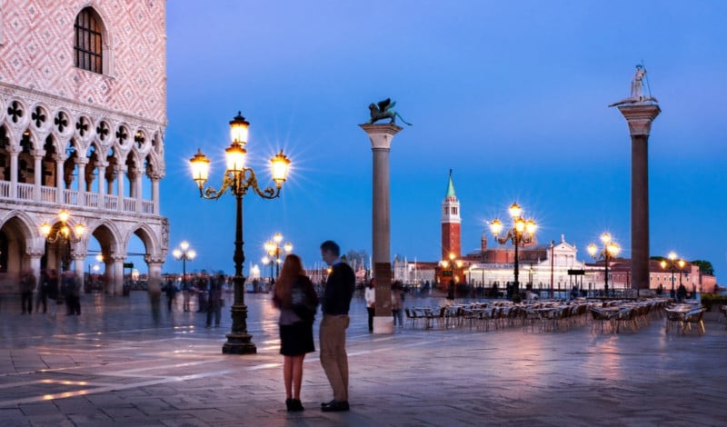
San Giorgio Maggiore, Venice
Take a look at this photograph taken in Venice. as in the previous one, one side of the frame is dominated by an ornate streetlamp. The campanile or bell tower of the church of San Giorgio Maggiore out on the Venice Lagoon helps counter-balance this. It also has an interesting secondary effect. We know that the bell tower is much bigger than the street lamp (as was the case with the Eiffel Tower in the previous shot). Due to the distance it of course appears smaller in the frame. This perspective effect adds a sense of depth to the photograph. We will be looking at more methods of adding depth to your photographs later on.
#6. Fill the Frame
From talking about how to arrange the elements in the frame, we now move towards looking at the space itself in the frame. One way of using the space is to completely fill it with your subjects. I often use this technique when showing off architectural details. By filling the frame, the viewer has the opportunity to explore the details of the subject.
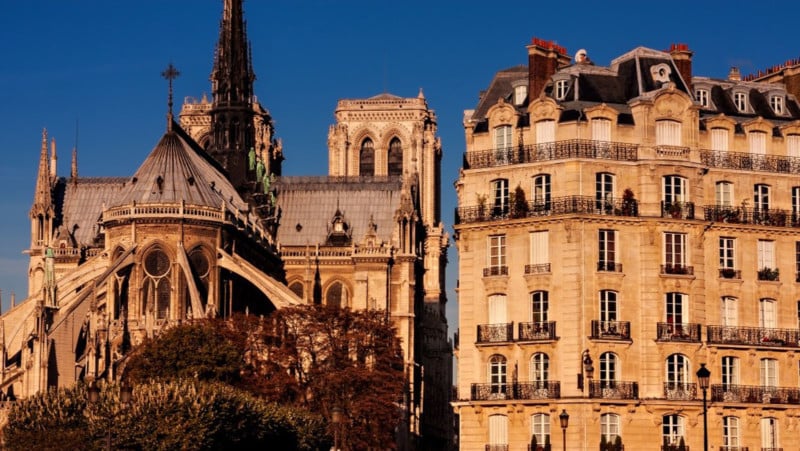
Notre Dame Cathedral, Paris
In this architecture shot, Notre Dame Cathedral and the adjacent buildings almost completely fill the frame. This allows us to explore details such as the flying buttresses, the stonework, or the ornate balconies on the building next door. It is a scene where the eye wanders around the frame. This can be a compositional technique in itself as we shall see later.
#7. Leave Negative Space in the Frame
And now…… I’m going to tell you to do the complete opposite of filling the frame. Leaving empty or “negative” space in the frame can help focus attention on your main subject.
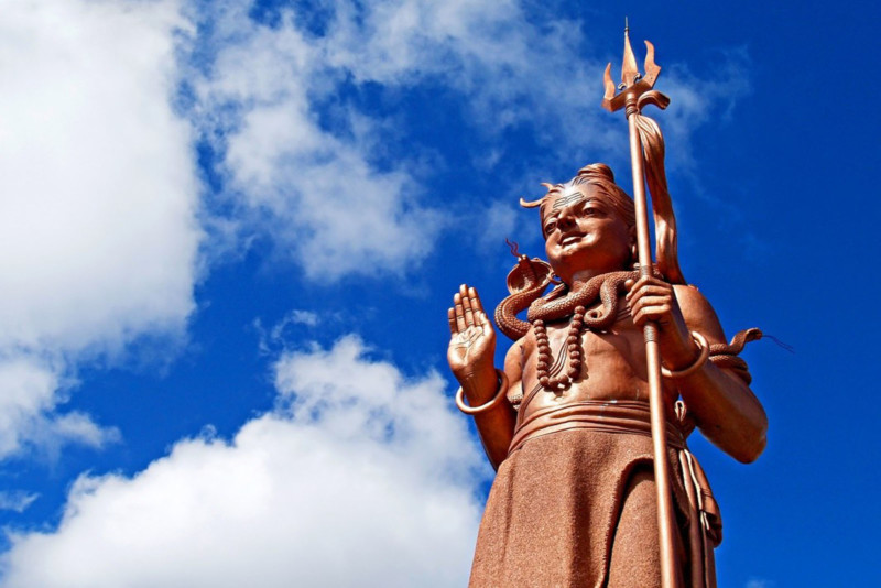
Statue of Shiva, Mauritius
In this photograph of the Hindu deity Shiva, there is very little to distract from the main subject. The statue is placed on one of the verticals of the rule of thirds and the rest of the frame consists only of the sky and some fluffy white clouds. The main subject is given “room to breath”. It is not competing with anything else in the frame. Notice how this seems to contradict the idea of balancing the elements in the frame we looked at a few moments ago.
When I last included this photograph in an article, there was an angry comment underneath telling me how stupid I was and the statue in question was actually in Nepal. Now unless I took a major wrong turn while flying over the Indian Ocean on my way to Mauritius, I was fairly certain I had never been to Nepal. What is it about Internet comment sections that makes people so angry about seemingly innocuous things?
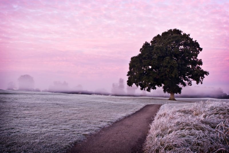
Maynooth, County Kildare, Ireland
This simple landscape photograph makes use of negative space. The misty morning actually helped obscure some of the background elements making the tree on the left really stand out with little to distract from it.
#8. The Rule of Space
The “Rule of Space” is the first of a trio of so-called composition “rules” that we will now take a look at. Again, I don’t like calling them rules but unfortunately, I didn’t get to name them. Booo. The rule of space is concerned with making sure your moving subjects have space to move into the frame rather than out of the frame. In a nutshell, this means that the subject should have more space in front of it than behind it. That said, I have seen many excellent photographs that break this “rule”.
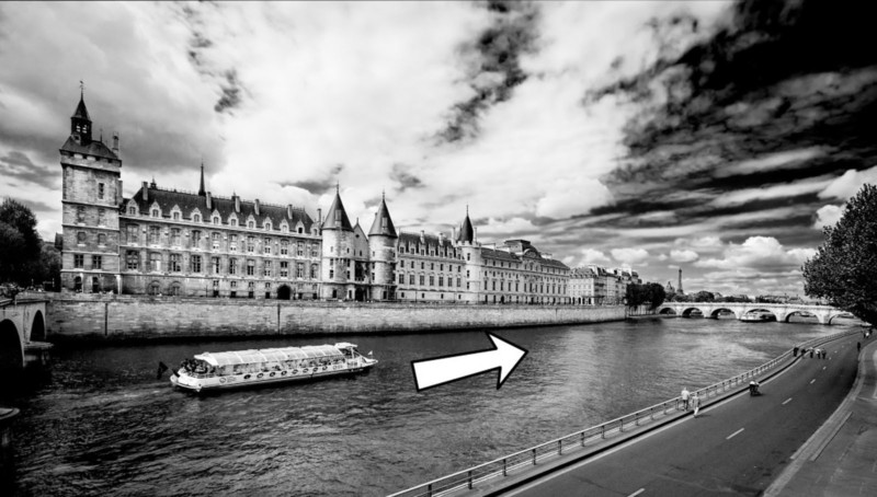
La Conciergerie and River Seine, Paris
In this photograph of a tourist boat on the River Seine in Paris, the boat is moving from left to right. Notice how there is much more space in front of the direction the boat is moving. We can imagine the boat continuing its course along the river into the frame. If it was over on the right of the frame, it would look like it was heading out of the frame.
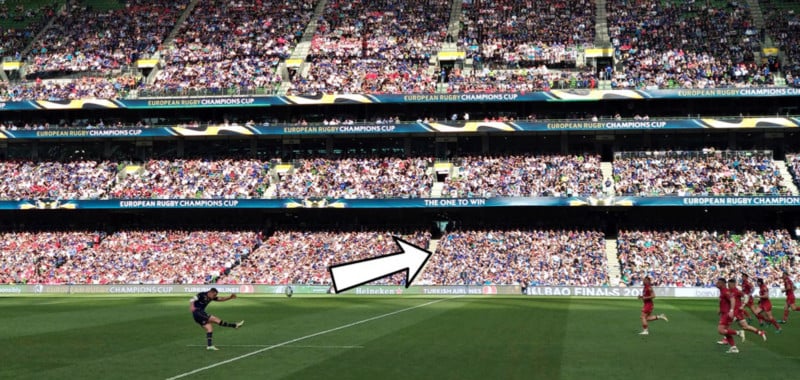
The Aviva Stadium, Dublin
Admittedly, I’m not much of a sports photographer but I quite like this shot I snapped with my camera phone during a rugby match featuring the mighty Leinster. Notice how the kicker (Johnny Sexton) is placed to the left of the frame and the ball is traveling into the space on the right. He made the kick by the way.
When I was a kid, the modern stadium you see in the photograph hadn’t been built yet. Instead, there was a rather basic and decaying old ground called Lansdowne Road. Back then, my dad used to lift me over the turnstiles to get in for free. We tried doing this again recently but with less success. I’m now 41 years old, have put on a few pounds since I was a kid and my dad has had a hip replaced.
#9. Left to Right Rule
This is a “rule” I find a bit daft, to be honest. There is a theory that we read an image from left to right as we would while reading a text. This means any motion in the image should be going from left to right. This completely ignores the fact that many languages are read from right to left or even from top to bottom.
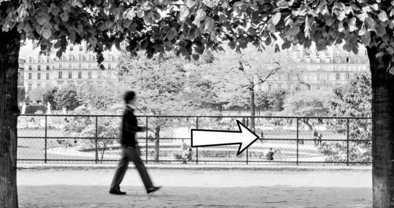
Tuileries Gardens, Paris
This photograph of a woman walking her dog is an example of a shot that does follow the left to right “rule”. It also follows the rule of space among others.
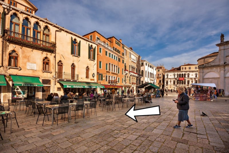
Campo in Venice, Italy
In this photograph, I completely ignored the left to right rule. Does the photograph suffer as a result? I don’t think so. What interested me was the woman walking across the beautiful campo while staring at her phone (as we so often do these days) as well as the colorful buildings bathed in the evening light. Frankly, I don’t really care what direction she is walking in. I suppose I could have asked her to walk back from where she came from.
Once during a club competition, a judge docked points from I photo I took in Tunisia for not adhering to the left to right rule. I argued that as the photograph was taken in an Arab country where people read from right to left, this should not apply. Unsurprisingly, I did not win.
#10. Rule of Odds
The world of photography of full of “odds”. Just visit any photography club and you’ll see. The rule of odds suggests that there should be an odd number of subjects in the frame. It is said by some that an even number of subjects divides your attention as the viewer is flipping their attention back and forth. What if you have four children? How do you decide which one to leave out of the shot? Maybe you could borrow a spare child from another family?
St. Mark’s Square, Venice
The photo above is an example of a time when the rule of odds can be effective. I deliberately framed the scene to include three arches. I think that two arches would not have worked as well in this case and may have indeed divided the viewer’s attention. It also so happened that there were three people in the scene.
St. Mark’s Square, Venice
This photo was also taken on Saint Mark’s Square. This time, it completely ignores the “rule of odds” several times in the frame. There are two principal human subjects, four street lamps, and two ornate columns, all even numbers.
It would also be a lot of trouble to get out my angle grinder to cut down one of the street lamps. As for the columns, I don’t know where I’d start. I’d need a very strong rope and a heavy truck at least. In Venice, that would have been a challenge. I could always ask one of the subjects to leave the scene or ask somebody else to join them I guess. Or I could just ignore the rule of odds.
#11. Photograph Simple Subjects
I love photographing dramatic vistas or busy street scenes. That said, simplicity can be a very powerful composition tool. Simple subjects with uncluttered backgrounds can make for interesting photographs. We saw this when looking at using negative space in the frame.

Droplets on a Leaf
I took this photograph in a friend’s garden. I’m not really into close-up nature photography myself but I did like the simplicity of this shot. The subject is simple: a few droplets of rainwater on a leaf. To me, its beauty lies in its simplicity.
#12. Use Black and White to Simplify your Photos
Converting a photograph to black and white can be a very effective method of simplifying your composition. In some ways, color itself can be a distraction. Black and white photography often allows us to focus on the textures, light, shadows, and shapes in the frame. Take a look at the following photographs taken along the Copper Coast in County Waterford, Ireland.
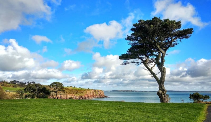
Copper Coast, County Waterford – Colour Version
The light in this version actually isn’t all that interesting. It’s that harsh daytime light that is rarely conducive to spectacular landscape photography. The location itself has potential though. Let’s see what happens when we convert this image to black and white.
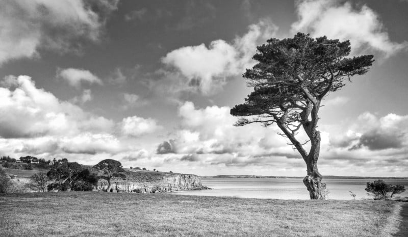
Copper Coast, County Waterford – Black and White Version
With the “distraction” of color removed, I think this becomes a much stronger shot. That harsh light now helps to highlight the textures on the tree, in the grass, on the cliffs, and in the sky. The bold shape of the tree stands out against the sky and the scattered clouds in the sky look more dramatic. The color was hiding much of this in my opinion. Not every shot is suited to a black and white conversion but in this case, I think it was.
#13. Isolate the Subject to Simplify your Photos
Using a shallow depth of field can be an effective way of simplifying your photographs and making the main subject stand out without distractions elsewhere in the frame.

Curious Cat
In this photograph, an aperture of f/3.5 was enough to simplify the composition by blurring the background and letting the main subject stand out without the distraction of a busy background.
#14. Let the Background Give context to the Subject
Now it’s time to contradict myself again. There are times when I like to use a busy background. In these cases, I want to background to provide some context to my subject.
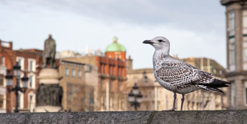
Dublin Seagull
This photograph doesn’t contain any old seagull. This is a Dublin seagull! The slightly blurred O’Connell Street in the background gives the subject some context. The fact that he was eating a bowl of coddle and drinking Lyons Tea when I spotted him also lets me know that he was indeed a Dublin seagull. Notice, how the background is still blurred but not so much that the seagull doesn’t stand out. It’s about getting a balance between not distracting from the subject and providing background context.
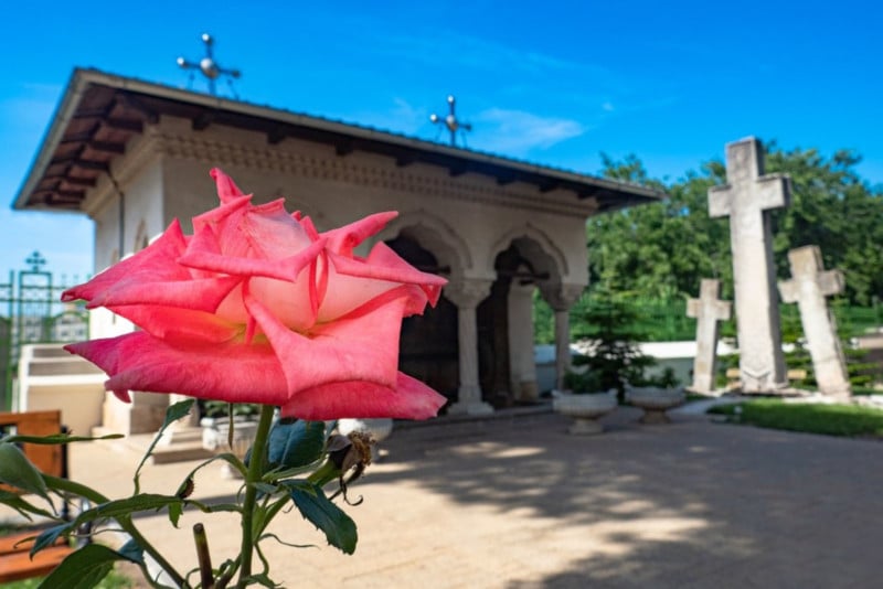
Dealul Mitropoliei – Bucharest
I took this photograph of a rose at a monastery complex on the outskirts of Bucharest, Romania. Once again I blurred the background just enough to let the rose stand out. There is still however enough detail to show the viewer the context that the rose was photographed in.
#15. Let the Eye Wander Around the Frame
And for my next trick, I will once again completely contradict myself. This is the antithesis to the concept of simplicity and minimalism. There are some occasions I like to take photographs with plenty happening in the frame. Take a look at the paintings of Pieter Bruegel to see an excellent example of art with plenty of different characters and activities going on in the frame.
Temple Bar, Dublin
This photograph was taken in the Temple Bar area of Dublin City. The frame is full of different characters and activity. In this case, the eye can wander around the frame noticing all the little details such as the flowers, the building details, and various people walking, exiting a building, or checking their phone outside a pub. There is no one main subject.
It is not a question of simplicity being preferable to complexity or vice versa. One isn’t inherently “better” than the other. It all depends on what you are trying to achieve with a particular photograph.
#16. Use Diagonals and Triangles
I already mentioned in the section on “golden triangles” that triangles and diagonals are said to add “dynamic tension” to a photo. My mother in law also does an excellent job of adding tension to any scene.
Horizontal lines and vertical lines suggest stability. If you see a person standing on a level horizontal surface, he will appear to be pretty stable (unless exiting the pub in the previous photo). Put this same man on a sloping surface and he’ll seem less stable. This creates a certain level of visual tension. We are not so used to diagonals in our everyday life. They subconsciously suggest instability.
Incorporating triangles and diagonals into our photos can help create this sense of “dynamic tension” and visual impact as a result. Talking about “dynamic tension” may also make us sound intelligent (or pretentious) in front of our friends.
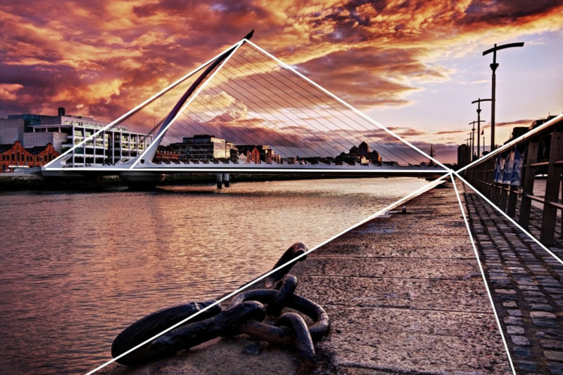
Samuel Beckett Bridge, Dublin
This photo of the Samuel Beckett Bridge in Dublin incorporates plenty of triangles and diagonals into the scene. The bridge itself is an actual triangle (It’s actually supposed to represent a Celtic Harp on its side). There are also several ‘implied’ triangles in the frame Notice how the leading lines on the right of the frame are all diagonal and form triangles that all meet at the same point on the right-hand side of the bridge. We will look at leading lines in more detail shortly.
#17. Patterns and Repetition
Human beings are hard-wired to look for patterns. Patterns can be very attractive and they suggest harmony. Using patterns in the frame can help to create a pleasing composition. We can find patterns everywhere from a man-made row or arches to the petals on a daisy.
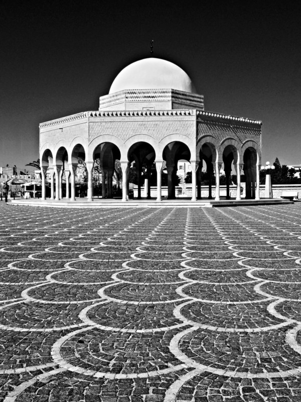
Monastir, Tunisia
I noticed these patterns in the paving stones of a square in Monastir Tunisia. I used them as foreground interest and leading lines to lead the viewer to the domed building which itself contains several patterns (the repeating arches for example). Black and white is often a good option for patterns as we can really push the contrast and bring out the textures.
#18. Break the Pattern
Sometimes using a pattern in your composition means breaking the pattern. This was actually suggested to me in one of the comments of the last article I wrote on composition.

Odd One Out | Adobe Stock
I’ve already said that some “rules” are there to be broken. The same goes for patterns. Breaking the pattern can really make your photograph pop. In this case, the single red candle really stands out among the vanilla-colored ones. It’s also slightly taller than the others which is another way of breaking the pattern. Notice how the photograph still follows the rule of thirds.
#19. Include Foreground Interest
Photographs are 2D by their very nature but there are certain composition tools we can employ to create a sense of depth in the frame. Including some foreground interest in one way of doing this.
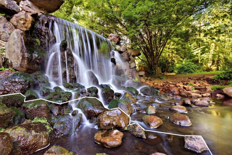
Sonsbeek Waterfall, Arnhem
In this photograph of a waterfall, the rocks provide the foreground interest. Foreground interest can be easier to incorporate into a photograph when using a wide-angle lens as was the case here.
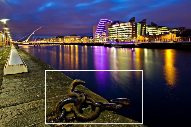
Dublin Docklands
In this case, I once again used a wide-angle lens to take the photograph. This time, I included a dock cleat as my foreground interest. This dock cleat was almost at my feet when I set up my tripod. This means that the frame contains an element that was very close to me as well as elements that were quite far such as the bridge. This is what helps to create this sense of depth. Printed very large on a wall, the viewer could almost imagine being in the scene.
A member of my photography club who was with me that evening tripped over one of the cleats and almost ended up getting a very close up view of the River Liffey. That’s one way of adding depth, I guess.
#20. Use Layers in the Frame
A very effective way to add a sense of depth to a photograph is to shoot a scene that contains layers of elements at varying distances from your vantage point. These layers can lead the eye through the scene from the foreground, through the middle distance to the background.
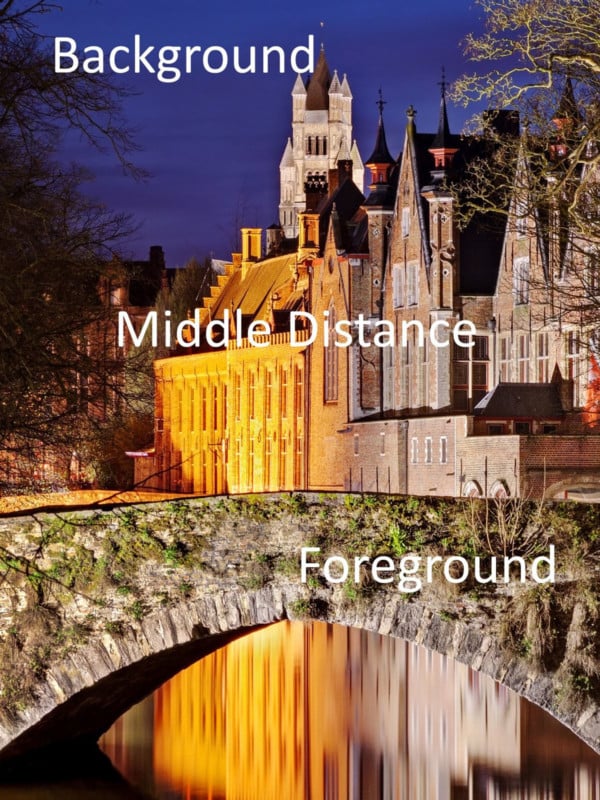
Groenerei Canal, Bruges
In this photograph of a canal in Bruges, the bridge acts as foreground interest. The buildings along the canal provide the next layer in the middle distance. These buildings then lead the viewer through the image towards the more distant elements. Finally, the bell tower from a distant church rises from behind the other buildings in the background. In this case, I did the opposite to the photos with foreground interest; I used a zoom lens to compress the perspective.
#21. Include a Frame within the Frame
Now we come to one of my personal favorite composition tools: using a “frame within the frame”. Often when I am out with my camera, I look for opportunities to create a “frame within the frame”. This could be an archway, door, window, or even trees and their overhanging branches.
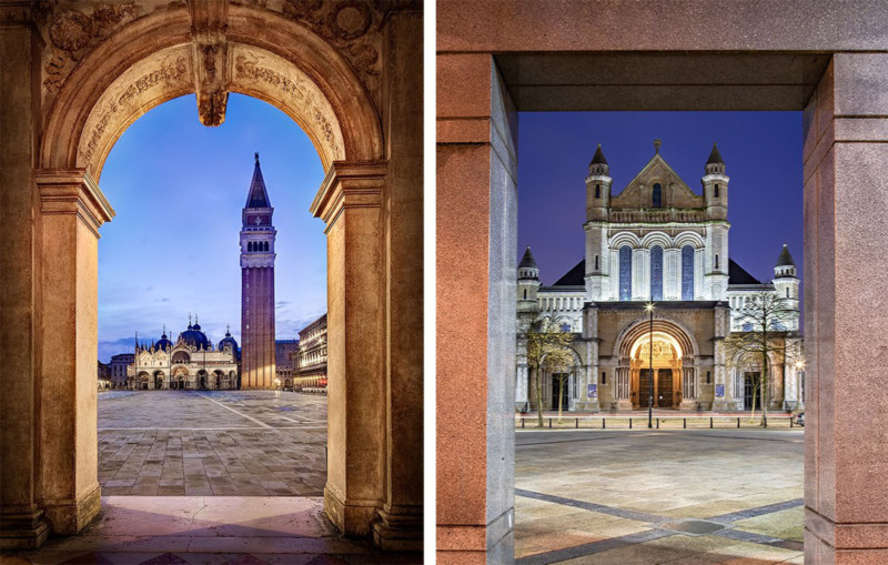
St. Marks Square, Venice | St. Anne’s Cathedral, Belfast
In both cases above, I used an archway to create a frame around the churches, which were my main point of interest in the scene. The arches work in a similar way to foreground interest in that they are close to the viewer whereas the churches are further away creating a sense of depth. Take a look at a Renaissance painting like “The School of Athens” by Raphael to see an example or arches being used as a framing device. In fact, in this painting, there are several layers of arches going back into the background that add an even greater sense of depth to the scene.
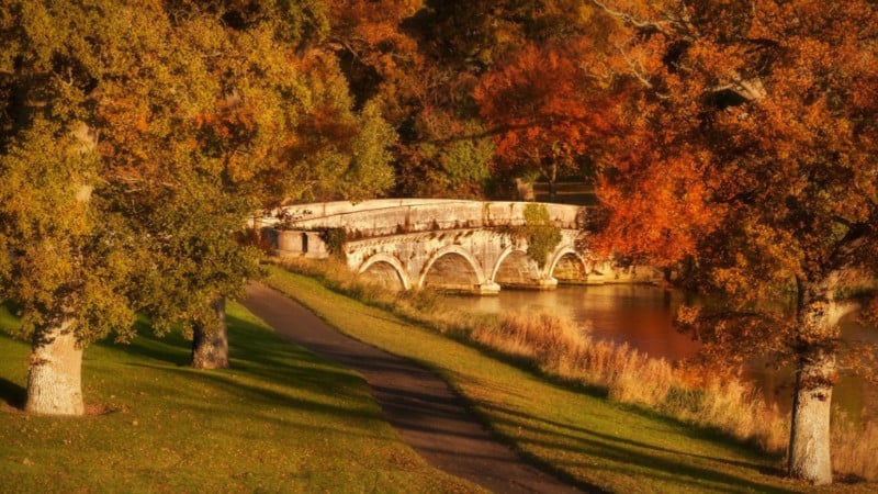
Maynooth, County Kildare, Ireland
Natural features such as trees can also be used to frame a scene. In this case, the Autumn trees frame the stone bridge. In this case, I also used a centered composition with the bridge in the middle of the frame. Note that the frame doesn’t necessarily have to completely surround your subject. It could be trees on either side, as is the case here.
#22. Leading Lines
Including leading lines in the frame is an excellent way of adding depth to your photographs. Anything from patterns, shadows, pathways, and walls can be used as leading lines that lead the eye to our main point of interest in the photograph.
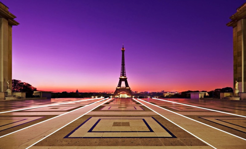
Eiffel Tower, Paris
When taking this photograph of the Eiffel Tower from Trocadero across the Seine, I used the patterns on the ground to lead the eye to the Eiffel Tower. Notice how the buildings on either side also provide a frame within a frame. The symmetry in the scene also lent itself to a centered composition. As you can see, it is often possible to combine several composition ideas in a single photograph.
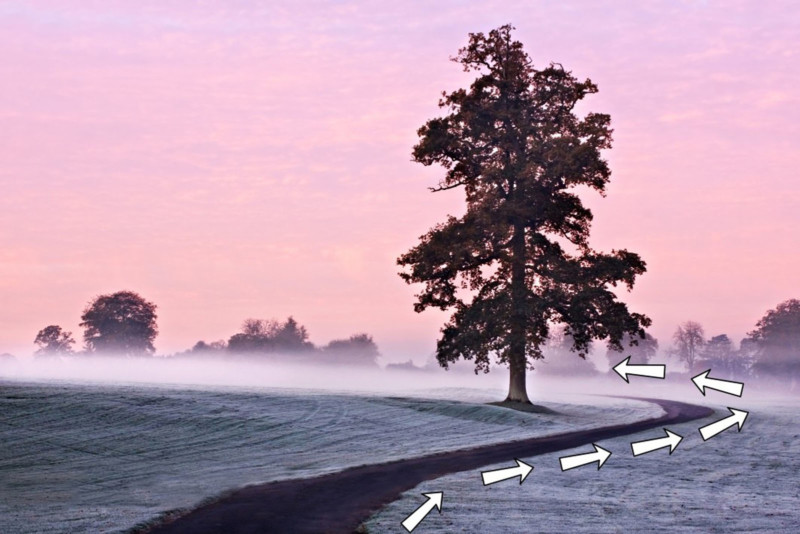
Maynooth, County Kildare, Ireland
Leading lines don’t even have to be straight. In fact, curves can be very attractive in a photograph. In this case, the backward “s” shape of the path leads us from the bottom left of the frame to the right and then back towards the tree. You will also see that I also used the rule of thirds and negative space as composition tools in the photograph.
#23. Colour Combinations
The use of color is often overlooked as a composition tool. Colour theory is something that graphic designers, fashion designers, and interior designers are all very familiar with. Certain color combinations can add real visual impact to a photograph.
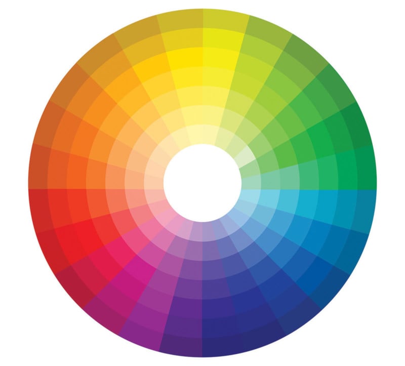
The Colour Wheel | Shutterstock
Take a look at how the colors are arranged on the color wheel above. Colors that are opposite each other are said to be complementary colors. When used together, they can be visually very striking.
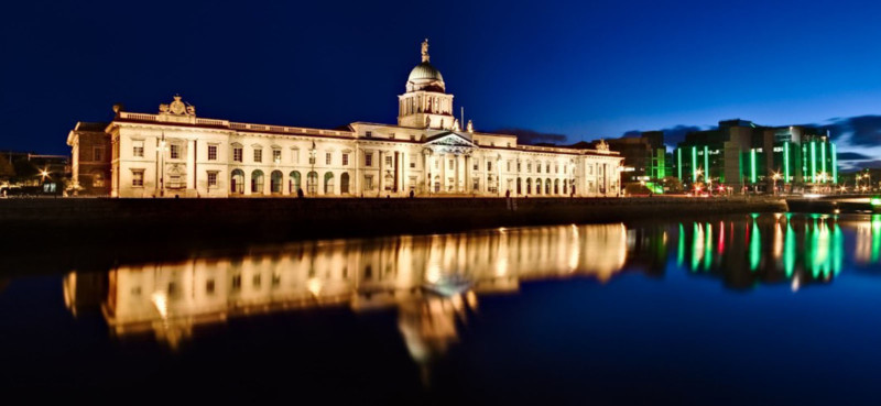
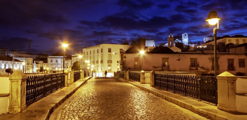
Customs House, Dublin
Take a look at the color wheel again. Notice how dark blue and yellow are roughly opposite each other. In this photograph, I have contrasted the deep blue of the sky and the yellow-tinted lights illuminating the quayside building. Yellow and blue is a particularly striking combination and is frequently used in movie posters as a result.
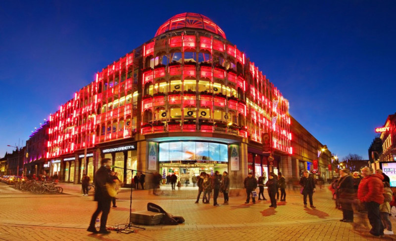
Stephen’s Green, Dublin
In this photograph, the deep blue of the evening sky is in striking contrast to the bright red of the building below. Blue hour is a fantastic time for city photography.
#24. Juxtaposition
Juxtaposition can a very powerful way of adding visual impact to your photographs. We often think about juxtaposition in terms of two or more elements that appear to contrast with each other. This is correct but it can also refer to two elements that complement each other.
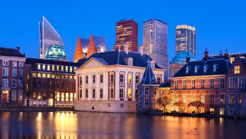
Mauritshuis, the Hague
In this photograph, there is a juxtaposition between the beautiful older buildings of the Hague in the bottom half of the frame and the modern skyscrapers that rise up behind them. The handsome building in the center is the Mauritshuis Museum which houses paintings such as “The Girl with the Pearl Earring” and “The Anatomy Lesson of Dr. Nicolaes Tulp” by Rembrandt.
I spent a few days cycling around the Hague on a borrowed bike made for a 6 foot 4 Dutchman. I am a 5 foot 5 Irishman so that was fun and quite terrifying as I dodged trams on the uneven cobbled streets. On several occasions, I got my bike wheels stuck in a tram line. In this case, you basically have two choices: fall to the left or to the right. I tried both on multiple occasions.
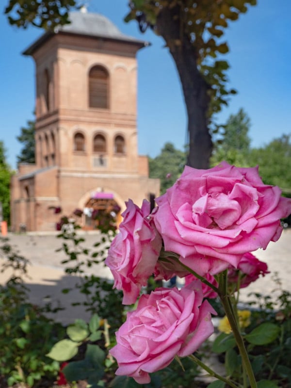
Dealul Mitropoliei – Bucharest
Contrasting the natural and built environments is another way of using juxtaposition, In this case, the delicate pink roses contrast with the solid man-made building in the background. In this case, I blurred the background but not so much that we can’t make what is there. We saw this in the section on letting the background provide context.
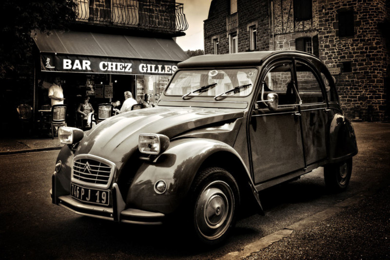
Meyssac, France
As I mentioned a few paragraphs back, juxtaposition isn’t always about contrast. In this case, the old 2CV car parked in front of a French café/bar in the little village of Meyssac has created the quintessential French scene. The two elements complement each other perfectly.
The man with his back to us in the cafe is the owner of the 2CV and he seemed surprised when I asked if it was ok to take a picture of his car. He asked why I’d ever want to take a photo of “that old thing”. He didn’t seem to realize that he had unwittingly set up a perfect photographic opportunity for me. Recently, the owner of the café contacted me to say thanks for the business this photo had brought his café.
#25. Add Human Interest
Including some human interest in a scene can make a photograph far more engaging as well as adding a sense of scale. this is something I sometimes forget as a mainly urban landscape photographer. I’ve noticed that most of my best urban photographs include people somewhere in the frame.
Ponte Romana, Tavira
The old bridge in the large town of Tavira in Portugal is a very attractive photography location in itself. This photograph would have been quite good without any human interest but I think the lone figure really makes this shot. The person adds life to the scene as well as giving a sense of scale to the surroundings. I had to wait a while for the right person to enter the scene and click the shutter at the right moment. We will see more about capturing these “decisive moments” next.
#26. Wait for the “Decisive Moment”
The idea of the “decisive moment” in photography is of course most associated with the great French street photographer Henri Cartier-Bresson. But what did Cartier-Bresson mean by the “Decisive Moment”? The great man himself said the following:
Your eye must see a composition or an expression that life itself offers you, and you must know with intuition when to click the camera. —Henri Cartier-Bresson
In the case of Henri Cartier-Bresson, this meant clicking the camera at the exact moment a man leaped over a puddle behind Gare Saint Lazare or capturing the fleeting cheeky expression of a French boy as he joyfully carried a bottle of wine in each hand through the streets of Paris.
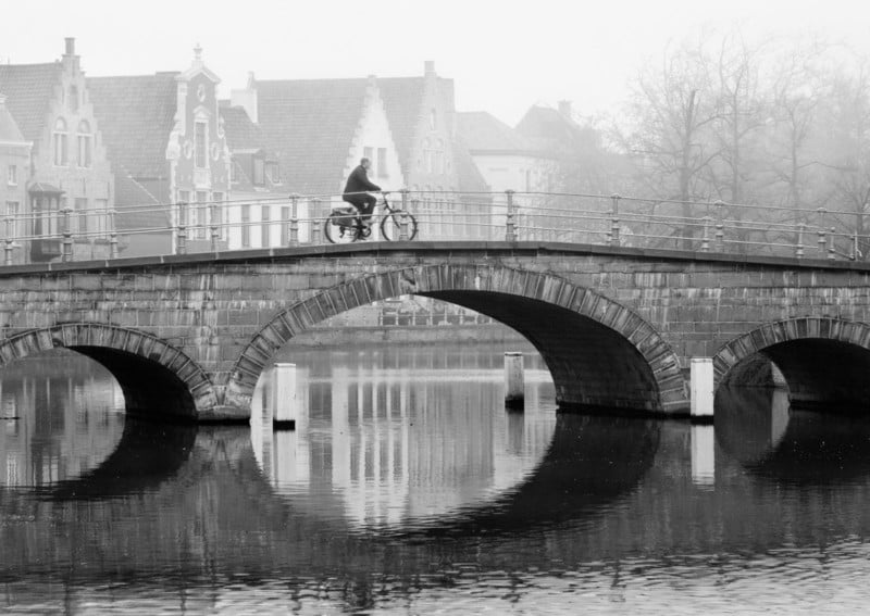
Carmersstraat Bridge, Bruges
This is actually one of my personal favorite photographs from my portfolio. I took it on an atmospheric misty morning in the picturesque Belgian city of Bruges. The location for this photograph was certainly interesting but for me, it is the man crossing the bridge on his bicycle that makes this photograph special.
This was one of those occasions when I had to wait for that exact right moment to press the shutter. I crouched beside a canal sidewall, composed my shot, and waited…. and waited…. and waited some more. Every so often, someone would cycle across the bridge but the shot would be ruined by a car coming in the opposite direction or perhaps the cyclist would look too modern for the mood I was trying to create in the final photograph – very inconsiderate in my opinion!
Finally, after about 45 minutes, I saw the gentleman you can see in the photo approaching the bridge. I waited until he was right in front of the light-colored building you see right behind him so he would stand out and pressed the shutter.
It was one of those moments I knew straight away that I’d gotten the shot I wanted from this location. I think it was worth the wait. I was quite lucky as there was a car coming from the opposite direction ready to spoil my shot. Thankfully for me the cyclist just beat him to the bridge. I think he should consider taking part in the Tour de France this year.
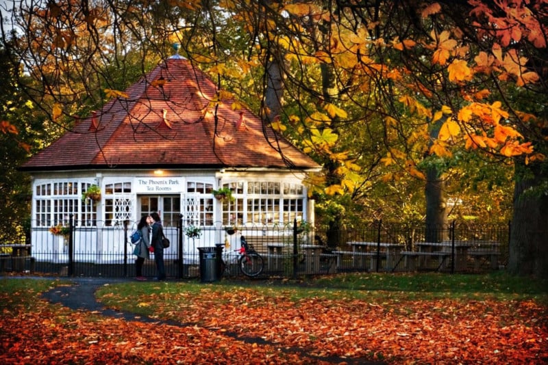
Phoenix Park Tearooms, Dublin
Sometimes capturing the “decisive moment” can be a case of being in the right place at the right time. In this case, I had already set up my camera to photograph the old tea rooms in the Victorian Era Phoenix Park in Dublin. As I was waiting, a young couple entered the frame and said goodbye with a tender kiss in front of the doors to the tea rooms. Patience and luck both play a role in capturing the “decisive moment” in your photographs.
#27. Shoot from Below
The vast majority of photographs are taken from head height. That’s not very high in my case as my experience with the borrowed Dutch bicycle demonstrates. Getting down low or up high can be a great way of capturing a point of view that is more dynamic or interesting. I have often seen wildlife photographers lying on their bellies to get that special shot.
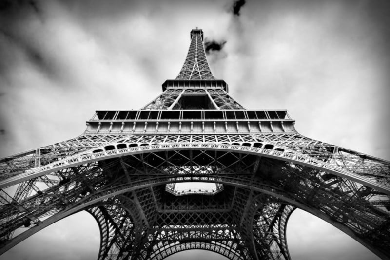
Eiffel Tower, Paris
I took this photograph of the Eiffel Tower while standing at its base and pointing my camera up. This was also a perfect occasion to use a centered composition due to the symmetrical subject. It means I have a photo that’s a little different from the majority of shots of this Parisian landmark.
#28. Shoot from Above
Whenever I visit a new location, I like to get high at least once. I also like to take photographs from a high vantage point at some point during my trip. Before my trip, I always research the possibilities to take some bird’s eye photos. Most cities and towns usually have a high building or bell tower you can climb to get some shots from high above your surroundings. Just make sure they allow tripods if you plan to bring one.
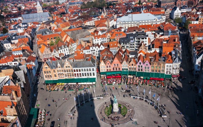
Markt from the Belfry of Bruges
I had to work extremely hard to get this shot of Markt Square in the heart of Bruges. For a start, I had to lug my camera gear up 366 narrow steps to the top of the Belfry. Now thankfully I’m in shape. Well I mean, round is a shape, isn’t it? As I wheezed my way to the summit, I think some of my fellow climbers were worried I might require medical attention. I actually met a guy whose office was right at the top of the belfry. He told me that he made the trip up and down the tower several times a day in a suit and dress shoes. Whereas I looked like I’d just climbed Everest; he barely broke a sweat.
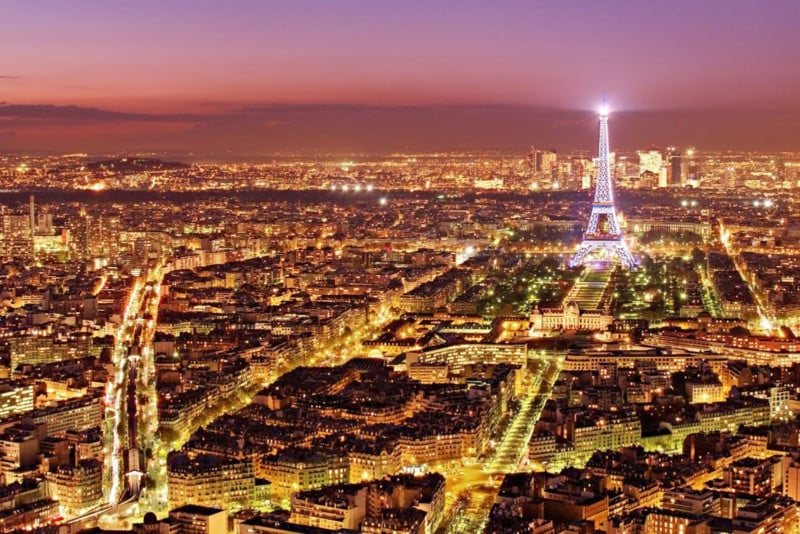
Paris from the Montparnasse Tower
When you think of places in Paris to climb up high, you immediately think of the Eiffel Tower. The problem with shooting from the top of Paris’ most iconic structure is that you can’t include the Eiffel Tower in your shot! This is why the viewing deck of the Montparnasse Tower in the south of the city is a much better location to capture a bird’s eye view of the City of Light. The tower itself is a pretty ugly building, to be honest, so being on top of it has the added advantage that you can’t see it while you are up there.
This photograph was taken just after sunset while there was still some color in the sky. I waited for the “decisive moment” the Eiffel Tower sparkled as it does for one minute on the hour, every hour throughout the night. If I had waited another hour, however, the beautiful purple tones in the sky would have been gone.
Conclusion
Several times in this series of tutorials on composition, I have told you that it is often possible to combine two or more of the composition ideas I’ve covered in one photograph.
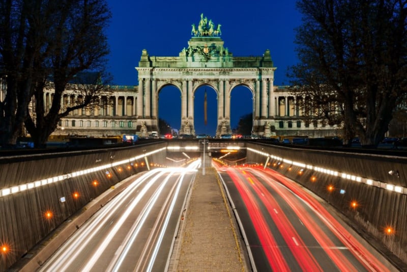
Arcade du Cinquantenaire, Brussels
This shot taken in Brussels combines several of the ideas we covered in this section: centered composition, symmetry, rule of thirds, leading lines, rule of odds, frame within a frame, and color theory.
Obviously, it would be impossible to have all of these composition ideas in your head as you are out shooting. Your brain would melt! However, a good exercise is to try to use one or two of them each time you go out with your camera After a while, you’ll find that a lot of these techniques become ingrained. You will begin to use them naturally without having to think about them. As you can see from the golden ratio, I used one of them without even realizing it!
I would also encourage you to ignore these guidelines completely when you think it will make for a more interesting composition. As I said at the beginning, these are ideas, not rules that must be obeyed at all times! Many of the ideas here however will help you come up with interesting ways of composing your photographs. You can still send me angry messages though. Those are always fun.
P.S. My Kindle e-book of photography tutorials, Outdoor Photography Essentials, is available from Amazon US, Amazon CA, Amazon UK, and Amazon AU. The tutorials cover: exposure, camera settings, composition and light. It can be read on most Kindles or any device with the Kindle app installed.
About the author: Barry O’Carroll is a photographer based in Dublin, Ireland. The opinions expressed in this article are solely those of the author. O’Carroll specializes in travel, urban, street, and landscape photography. He also teaches photography in person, online, and through tutorials. You can find more of O’Carroll’s work on his website, Twitter, and Instagram.
Continue reading...