
1. In what area is critique to be sought?
I been trying to figure out how to get a nice balance of colors in landscape photography. Personally i dont like it when pics are over saturated and fake looking like HDR but it seems most people like it.
So i m trying to train myself to have an eye for color in the right balance
2. What one hopes to achieve with the piece of work?
The smooth buttery mix of rich colors where they blend into each other nicely but still dont look too fake.
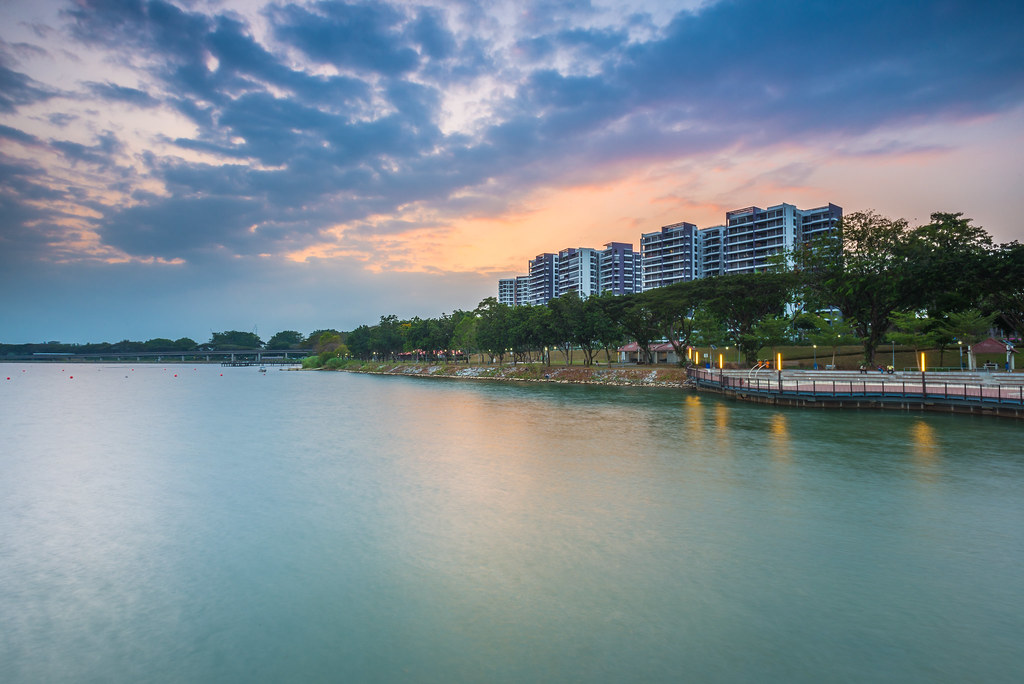
3. Under what circumstance is the picture taken?
Slightly pass magic hour time on a wooden bridge with some Soft and hard ND to play around with
4. What the critique seeker personally thinks of the picture.
I like the composition but i dont understand what is consider nice about smooth water and strongly saturated pics. trying to understand and be better at it since most people like it
Last edited:
")


