Simple Cityscape B&W


nissanmanic

New Member
Mar 13, 2010
522
0
0
Singapore (Ulu Pandan)
5827352937_90fb58636d_b.jpg

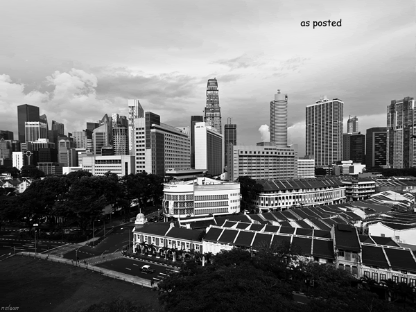
Hi, have this photo for critique as I am not sure whether the photo "works" or not.

1.in what area is critique to be sought?

I would like feedback on composition and B&W processing.

2.what one hopes to achieve with the piece of work?

Actually just wanted to "document" the current Singapore cityscape, capturing the current cityscape before more development changes the cityscape.

3.what the critique seeker personally thinks of the picture

I am quite satisfied with the B&W processing but I have doubts about the composition for this (i.e sometimes I think it's pleasing, sometimes it's not). Hence seeking other opinions.

P.S. I will be away in S. Gedong for a short chalet this week, so my replies will come after. TIA for any critiques/comments. =)
 

There are basically 2 main area in this photo. The preserved shophouses and the newer skyscaper at the back stretching from left to right. Two buildings stand out most here are the Capital Tower and the former treasury tower.

The perspective view of the URA Centre and MND building and the rows of shophouses that line along Neil road and Tanjong Pagar road form some interesting lines in the photo. The space (trees over Maxwell fc), road junction and grass field at the left bottom corner create quite a big negative space in the frame. The same negative space of the near empty sky have a similar effect too.

Now you probably should have a better idea where to crop it or recompose the frame.
 

Hi coolthought,

Please see below for my feedback:

1.

i. Composition:

Plus points: The different contours of the buildings does provide some visual interest in the image. A careful crop of the photo may make this photo a great abstract image in terms of architectural lines.

Areas to improve on: For photography, photographers usually look for specific areas of interests, even for landscape photography. While your photo looks interesting in terms of architectural lines, the photo doesn't direct the viewers' eyes to any specific areas of interest. There is too much space given to the sky area and the trees in the foreground distracts and doesn't add interest to the image.


ii. Black and White processing: No comments, as this is not my specialty.


2.what one hopes to achieve with the piece of work?

Actually just wanted to "document" the current Singapore cityscape, capturing the current cityscape before more development changes the cityscape.

Patrick: This is a great reason to take photographs, and this is one primary reasons but many budding and professional photographers. If you are are able to develop motivations for taking pictures, that will be great. :)

3.what the critique seeker personally thinks of the picture

Patrick: A above-average photo to me. Slight cropping cropping of the top and bottom portion with selective cropping in the middle section will enhance this picture greatly - in terms of visual appeal.

Keep up the enthusiasm!
 

Hi coolthought,

Please see below for my feedback:

1.

i. Composition:

Plus points: The different contours of the buildings does provide some visual interest in the image. A careful crop of the photo may make this photo a great abstract image in terms of architectural lines.

Areas to improve on: For photography, photographers usually look for specific areas of interests, even for landscape photography. While your photo looks interesting in terms of architectural lines, the photo doesn't direct the viewers' eyes to any specific areas of interest. There is too much space given to the sky area and the trees in the foreground distracts and doesn't add interest to the image.


ii. Black and White processing: No comments, as this is not my specialty.


2.what one hopes to achieve with the piece of work?

Actually just wanted to "document" the current Singapore cityscape, capturing the current cityscape before more development changes the cityscape.

Patrick: This is a great reason to take photographs, and this is one primary reasons for many budding and professional photographers. If you are are able to develop motivations for taking pictures, that will be great. :)

3.what the critique seeker personally thinks of the picture

Patrick: A above-average photo to me. Slight cropping cropping of the top and bottom portion with selective cropping in the middle section will enhance this picture greatly - in terms of visual appeal.

Keep up the enthusiasm!
 

Hi coolthought,

Please see below for my feedback:
1.

i. Composition:

Plus points: The different contours of the buildings does provide some visual interest in the image. A careful crop of the photo may make this photo a great abstract image in terms of architectural lines.

Areas to improve on: For photography, photographers usually look for specific areas of interests, even for landscape photography. While your photo looks interesting in terms of architectural lines, the photo doesn't direct the viewers' eyes to any specific areas of interest. There is too much space given to the sky area and the trees in the foreground distracts and doesn't add interest to the image.


Hi hi :)

Just re-emphasizing a very good point. For this sort of urban landscape shot, there is probably too many things to see. The above points will greatly help to improve on the photo.

so. nissanmanic. how do you think you should reframe it?

I will leave the black and white comments for other peeps who are a lot more competence in this area. :)
 

Actually just wanted to "document" the current Singapore cityscape, capturing the current cityscape before more development changes the cityscape.
***
I am quite satisfied with the B&W processing ....

Even though your aim is journalistic, this image might be made more dramatic and appealing to the eye. I was a little bothered by the lack of detail in the shadow areas at bottom left and across the bottom.

It's hard to judge your B&W conversion without seeing the color original, but I suspect it could be made a little more dramatic and eye-appealing without losing your journalistic purpose. Using the B&W you posted, I was able to make some improvements (at least in my estimation), and I suspect a good deal more could be done starting with the color original. My aim was to tone down the bright sky (which attracts my eye) and brighten the darker details of the buildings to give them more emphasis.

cityscape.gif
 

Because its in black and white, the trees looked clumped together and don't really look like trees, it look more like a lump or a silhouette. HDR the picture will bring out the details more.
 

I like the contrast between the old shophouses in the foreground and middle ground, against the towering skyscrapers in the background.
Overall a pretty good job.

To me, this angle creates a 'wall' of sorts, making the photo look a bit 2D.
I do think that Maxwell Rd could have been used more as a means to show depth in the photo.
Perhaps shooting from the next block on the left would yield better results?

Also I think your B&W conversion has gone a bit too high-contrast. The blacks are quite strong, yet the sky seems rather muted. Considering that the upper 1/4 to 1/3 is all sky, it is worth paying attention to it as an integral part of your final image.
 

the tones in the photo look uneven with the bright sky and dark foreground foliage. adjusting the backlighting and exposure to even out the tones more will gibe the photo better balance and visual appeal.
5836057759_477b40afc9_o.jpg
 

Hi! after considering all the feedback, i think the fundamental problem is a lack of a main subject or anchor. I was going for a high contrast B&W for this one, and chose to blacken the trees as i thought they were distracting, maybe I should've still retained some details for the trees. I did a 16:9 crop, it improved on the negative space on the bottom left, but it did take away some of the shophouses, which is an element i wish to keep in its entirety. I think, unless the fundamental problem of not having a dominant subject is solved, this photo will only be mediocre at best.

Thanks all for the comments once again and I hope to learn from you people!
 

You are photographing a scene. Although having an anchor is good but its not always possible (or even necessary) for cityscapes. What's more important is that you can find a way to photograph the scene in an aesthetically pleasing(highly subjective) manner and fulfill your intentions at the same time. What caught my attention was the foreground. It appeared rather unbalanced with the shophouses on the right and vacant land and luch trees on the right. Then again, this could well be a successful documentation of downtown Singapore for its diversity of spaces. Perhaps a wider perspective would help. I do think the contrast kills the idea a little though because most of your foreground is in shadow.
 

Hi all,

Thank you once again for the valuable feedbacks. This is the mark II version:

5875750859_b0a2a8943c_b.jpg

Went for a 16:9 crop that eliminated the empty spaces and the tree on the bottom RHS and gave a pseudo wide-angled panoramic look , retoned the B&W to reduce the "black-ness" of the foreground and did some more perspective adjustment. Admittedly, it is still rather right side heavy but I think it has improved upon the original. I am hoping that with the new B&W toning, the eyes will now be drawn more to the buildings than to the sky.

As above, feedback is always welcome and thanks for contributing your opinions! =)
 

Hi, I am no expert so dont mind me sharing my opinion.

I would love to see if you could tell a story of how old buildings in Singapore are being 'eaten up' by newer sky scrappers.

Something like old shophouses take a centre stage and you show a nice row of it with roofs and all, but at background there slightly blured skyscrapers to say that the days of these historical buildings in Sg are numbered as modernism will catch up to it.

Technically I do like the B&W treatment cause it can gel well with the story above.
 

No problem, I am always open to opinions and discussion! That is a very good suggestion and one i will take note of while shooting in the future! You mean something like this?

255918_10150233456706977_521571976_7638653_6147170_o.jpg
 

No problem, I am always open to opinions and discussion! That is a very good suggestion and one i will take note of while shooting in the future! You mean something like this?

255918_10150233456706977_521571976_7638653_6147170_o.jpg

good attempt.

to me is not balance in some way..maybe is the background...

since you said "Simple Cityscape", start your shot simple too....
 

Last edited: