The Fisherman


shellshox

New Member
Oct 15, 2008
268
0
0
5197189415_057148d397_b.jpg


First time I'm submitting to C&C, all comments welcome!

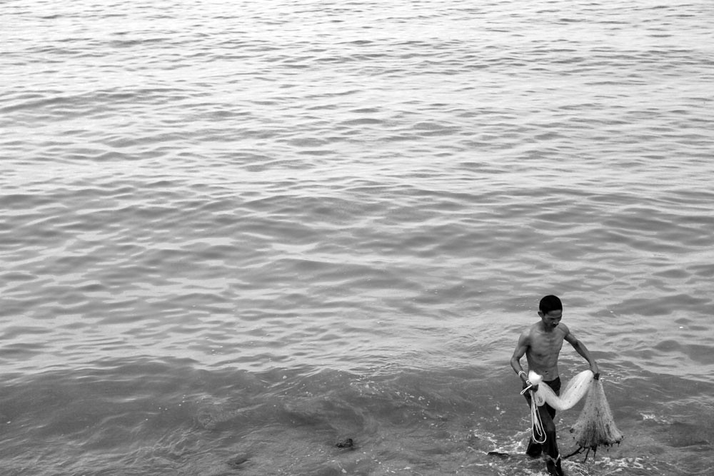
1. In which area is critique or feedback to be given?
- Exposure, composition, B&W technique.

2. What were you hoping to achieve with this image?
- To break the monotony of the sea with an interesting looking subject.

3. Under what circumstance was the picture taken? (physical conditions/emotions)
- Day time, slightly cloudy, grey sky.

4. Thread-starter's personal thoughts about the image.
- It looks like the picture could have been taken anytime in the past, it has a classic look to it, to show that certain activities(in this case fishing) could be done at anywhere in the world at any time.
 

Compo wise, main subject cutting too close to the edge...

Exposure wise, would prefer more white/contrasty histogram.
 

It appears to me that the fisherman is walking towards the land/beach. If you are able to show some land on the bottom, cut-off some part of the sea on the top and have slightly more space on the right of the pic, I think effect may be better.
 

Last edited:
Similar to the earlier comments.

The bottom is cropped too tight - even the foot is chopped off. And unless the fisherman is still some way from the shore, it would be better to show some beach.

Considering it is a b/w shot, you can afford to boost the contrast and sharpness here.

But the vast empty sea does indicate he left with an empty catch.

Nice catch (no pun intended) though.
 

Tighter crop, too much dead space.
Boost contrast.
 

Compo wise, main subject cutting too close to the edge...

Exposure wise, would prefer more white/contrasty histogram.

It appears to me that the fisherman is walking towards the land/beach. If you are able to show some land on the bottom, cut-off some part of the sea on the top and have slightly more space on the right of the pic, I think effect may be better.

Similar to the earlier comments.

The bottom is cropped too tight - even the foot is chopped off. And unless the fisherman is still some way from the shore, it would be better to show some beach.

Considering it is a b/w shot, you can afford to boost the contrast and sharpness here.

But the vast empty sea does indicate he left with an empty catch.

Nice catch (no pun intended) though.

Tighter crop, too much dead space.
Boost contrast.

Thanks for the valuable inputs! I've also felt that there might be some issues with the feet getting chopped but i kinda like the composition of him in the corner. Will take note next time. As for boosting the contrast, will try it out as well. Was afraid it might blow out the highlights but since u guys think its ok, will boost contrast a bit more next time. :)