Stepping Stones


SnapForPassion

New Member
May 30, 2010
23
0
0
34
Jurong West
BnWSteppingStones.jpg


1. In what area is critique to be sought?
Techniques, Composition and PP

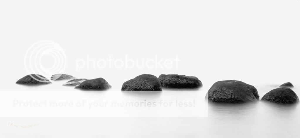
2. What one hopes to achieve with the piece of work?
Mystical and mysterious stepping stones.

3. Under what circumstance is the picture taken? (physical conditions/emotions)
Taken around 8pm at Punggol Beach without any use of filter.

4. What the critique seeker personally thinks of the picture
Not sure if I have overdo the PP. The stones seems to be like floating on the air but it's actually half submerge on the water.
 

Very good composition, but i little over expose to me. Maybe its your style. Try to show it in colour maybe its better than in B/W(My Opnion). Are you using 16:9 framing?
 

Exposure-wise pretty good, but a bit lacking composition-wise. I think it would have been much stronger if the rocks were shot as a path leading away from the viewer.
 

This photo didn't work for me.

Composition-wise, framing of the stones in a horizontal line does not concur with what you're trying to portray. You're trying to give the impression of stepping stones, but the arrangement of the rocks makes it such that there is no progression, no sense of going forward as would be expected of stepping stones.

I was thinking, given your title, a composition with the rocks leading to the horizon would have been better. Something similar to this here which I shot before. Alternatively, you could have straighted out the rocks in a horizontal line instead of leaving it half slanted, which added nothing to the photo, making it look half-hearted instead.
 

Last edited:
My feedback:

1. Exposure wise, I think you did not handle well enough. The water is way too over exposed. You should pull it back a little. Even if it is a minimalist kind of shot, the blown highlights makes the picture too jarring. my eyes hurt if I look at your picture too long.

2. Composition wise, I think you could have done better. position the stones to lead the viewer into the picture would be nice. Cutting across the frame looks a little abrupt. Not to mention you did not give enough space between the rocks the the left and right edges of the frame. Also a black frame here would work well, as your picture is predominantly white, and the background of this forum is white as well.
 

...Composition wise, I think you could have done better. position the stones to lead the viewer into the picture would be nice....

Agree with daredevil123 about the composition. Would have preferred you taking the shot in portrait format with the stones forming a vertical path, the perspective would make the rock nearest to you larger and gradually shrink as it leads you into the background. :) Just some of my thoughts. Experiment and try to see what works out best :)
 

Very good composition, but i little over expose to me. Maybe its your style. Try to show it in colour maybe its better than in B/W(My Opnion). Are you using 16:9 framing?

Thanks. 16:9 framing as in? I did the cropping manually.

Exposure-wise pretty good, but a bit lacking composition-wise. I think it would have been much stronger if the rocks were shot as a path leading away from the viewer.

Haha. Thanks. Will take note of it :)

This photo didn't work for me.

Composition-wise, framing of the stones in a horizontal line does not concur with what you're trying to portray. You're trying to give the impression of stepping stones, but the arrangement of the rocks makes it such that there is no progression, no sense of going forward as would be expected of stepping stones.

I was thinking, given your title, a composition with the rocks leading to the horizon would have been better. Something similar to this here which I shot before. Alternatively, you could have straighted out the rocks in a horizontal line instead of leaving it half slanted, which added nothing to the photo, making it look half-hearted instead.

Candy now that you mention it, I realise you got a point there. The title did not bring out what the photo is trying to say. No sense of going forward is really true. Hmmm a wrong photo for the title. Thanks for pointing this out :) Anyway nice photo you had!
 

My feedback:

1. Exposure wise, I think you did not handle well enough. The water is way too over exposed. You should pull it back a little. Even if it is a minimalist kind of shot, the blown highlights makes the picture too jarring. my eyes hurt if I look at your picture too long.

2. Composition wise, I think you could have done better. position the stones to lead the viewer into the picture would be nice. Cutting across the frame looks a little abrupt. Not to mention you did not give enough space between the rocks the the left and right edges of the frame. Also a black frame here would work well, as your picture is predominantly white, and the background of this forum is white as well.

Hi devil, thanks for the pointers :) I guess I have overdone the pp (brighten the whole picture) that results in overexposed. I also do feel that the picture is jarring especially on the left. And yes, adding a black frame for the picture would be a better choice since the background of the forum is white. I should have better positioned myself when taking this picture. Will look more into the positioning of the subject and myself when taking the shot next time!

Agree with daredevil123 about the composition. Would have preferred you taking the shot in portrait format with the stones forming a vertical path, the perspective would make the rock nearest to you larger and gradually shrink as it leads you into the background. :) Just some of my thoughts. Experiment and try to see what works out best :)

Oh ya the thought of taking the shot in portrait format never occurs to me. Silly me :( tried to imagine what you have suggested and realise it will give a better result than my current one, got to experiment what you said on my next trip. Haha! Thanks zion ;)