1. in what area is critique to be sought?
General C&C, further ps into something more interesting... like a painting and to which level of manipulation that you will still find it good or best.
2. what one hopes to achieve with the piece of work?
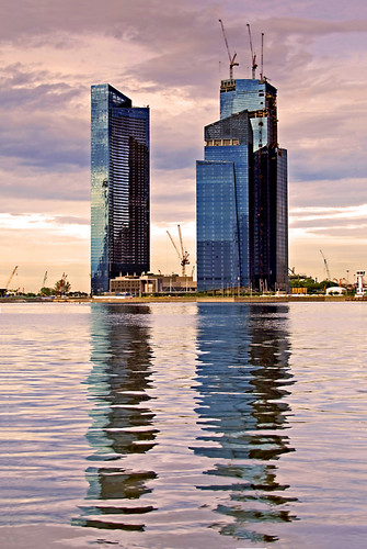
I added yellow filter and increase saturation to bring out more colours to an otherwise bland image into something more interesting... like a painting
3. under what circumstance is the picture taken? (physical conditions/emotions)
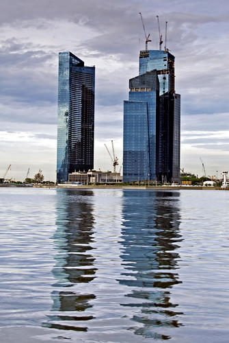
(See my post for the original image)
This final image isn't what I originally intended for when I post processed it.
Using ps to try to improve on the tonal quality of this image, somehow it became clear that this might be further ps into something more interesting... like a painting. I added yellow filter and increase saturation to bring out more colours to an otherwise bland image.
4. what the critique seeker personally thinks of the picture
Fall blindly 'in love' with my own work after added yellow filter and increase saturation to bring out more colours to an otherwise bland image that now looks like a painting.
Dear mod. This is my second request of the same image for critique. There is a same image in Kit's #3 Outing Photo thread. There isn't any feedback on this image for that thread and I really wanted to know the general csers their view and opinion on this image. Thank you.
This final image isn't what I originally intended for when I post processed it.
Using ps to try to improve on the tonal quality of this image, somehow it became clear that this might be further ps into something more interesting... like a painting. I added yellow filter and increase saturation to bring out more colours to an otherwise bland image.
1. General C&C
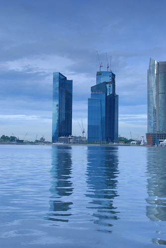
2. Your opinion on an image taken by a digital camera that was post processed to look like a painting. Yes. Opinion can be very personal but please include reason why you like or dislike it and as well as to which level of manipulation that you will still find it good or best.
This will help me to do a reality check and not to fall blindly 'in love' with my own work. It will help me to decide whether to further explore into this area of post processing.
Thank you.
A larger image can be view here
Last edited:
")