Product Shoot newbie


Status
Not open for further replies.

LQ235

New Member
Apr 28, 2008
54
0
0
East
DSC04347.jpg


Hi, I was bored so I decided to a product shoot on my "sample" giorgio armani perfume.
As you can see the setup is a cheapo one as I have used 2 white A3 papers for the back and foreground, I have placed my flash behind it and pointed it towards me at 1/2 power. I wanted to portray a dark mood so I have used high speed sync with a shutter speed of 1/500 and aperture of f/8..

Points to critiqued on:
1)Is the overall image presentable to the public?
2)Is the image useful in influencing the masses to go n buy the product?
3) Any other points that will improve on my product shoot skills is appreciated..;)

p.s. Do backup your critiques with logical reasons..thank you n sry for the long intro..:D
 

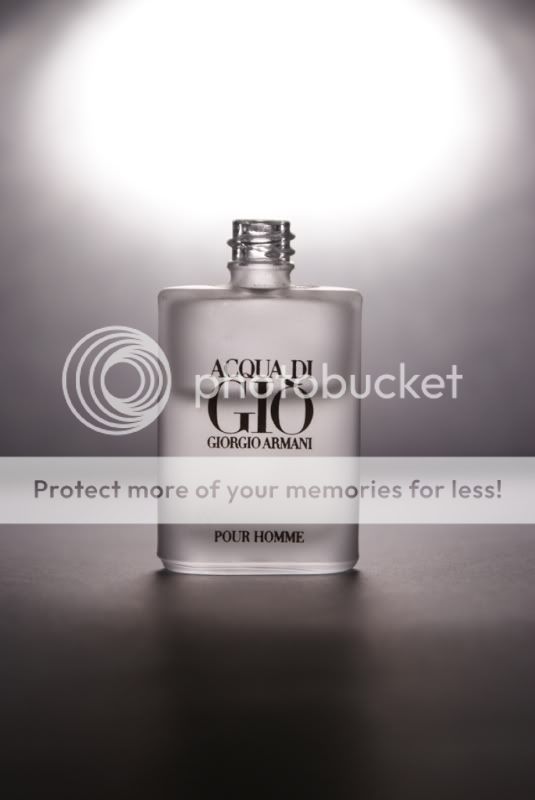
1.) No. Just by a simple comparison with existing print advertisements against the composition and execution of your image, yours is severely lacking. It lacks the certain refinement, class and taste of the product and brand name. Is it a correct representation of the product/company? Is the image a marketable product?

2.) No. What do the masses know about the product? I am one of them. After googling it I found, "Mood: Natural and authentic. Woody marine freshness". You say you wanted to present it in a 'dark mood'. But, is it something the company/designer would want this cologne to be associated with? Granted you can't very well ask them for advice but logically, you present a product as it is. Do research your product, how do you sell something without knowing what it means. Especially when you are trying to sell someone else's product (not to mention the someone is Giorgio Armani, an international luxury brand). You have to know who is your defined market. New users or existing users? Existing users would know the newly launched products, so when you show them your above image, they instantly know what it is. New users wouldn't know A from B and unless the image is strikingly beautiful or they are already interested in the brand, would forget seeing the image in 2 secs. All this determines how you compose your selling image.

3.) There are many things about the composition that's just not sellable. Ok point by point.

- A 'dark' mood, how is it presented here? What is your defination of a 'dark' mood? Commercially it would be dark like this, is that what you were trying for? I think you can see the difference and how one is more classy than the other. Your image is too bland, colourless. Colourful images attract the eyes, you want the product to be the highlight, not the hotspot.

-Uncreative. This ties with research not being done. This is being technically proficent, not being creative. It's understandable to be working on a tight budget, but one can still be creative. Ask yourself more questions. How else can/do you sell the product? If you are a user, you would know how it feels to wear the cologne; what does this cologne provide you that others don't. How do you present that to the masses? I don't feel you have done a reasonable job in convincing the market with just the above image. Work on their tag, '.... create a masculine scent that is both fresh and sensual'. Give something the company can use, if you shoot it as dark and moody, it doesn't conform to the product image.

-Finally what is with that uncapped bottle.... Companies can be picky about their products, shoot their cologne and leave the cap out? They won't like it if they view the cap as part of their signature. Anyway, there isn't much reason to leave the cap off even if the company doesn't complain. Ordinary people like me will still ask about the cap. And of course, shoot a full bottle next time. Replace the cologne with plain water if you must. Ads always show the product being bigger or fuller than it really is, because it's better than having consumers wonder if they are paying full price for half amount.

Being able to come up with an idea while being bored is good. But one still has to back it up with research and preparation. You can shoot a product simply and technically proficent. Or stellar and technically excellent. It's all about your standards and how far you want to reach. Cheers.
 

If you don't mind my short comment, I find it really not sharp at all. Need a logical reason for this? I guess your image is it.
And thanks foxtwo for the elaborate response.
 

Adding the bottle cap, a full bottle, better subject lighting (you're lighting the subject, not the background) and better focus / DOF would've been better. I'd say this is a conceptually sound photograph that wasn't exactly well executed.
 

1.) After reading your take on this, yes i did feel it to be severely lacking. Point Noted!

2.) As said in my earlier post, that i didnt have enough materials, props and only equipped with 1 flash, i made do with what i have. If being equipped with a proper studio, lightings, i "might" have done a better job than this. Nevertheless, kudos to you for pointing out that i should have done my product research first before shooting the product. Point Noted!

3.)"A 'dark' mood" :Colourful images attracts the eyes,product to be the highlight and i will take note of the "hotspot".:thumbsup:
"Uncreative" :Work on the product tag. Noted!
"Finally what is with that uncapped bottle" : haha, i knew somebody would spot that out. ok reason being i left out the cap as when i put the cap on it will look crooked, like it will tilt some degrees to right,therefore if i had left the bottle wif the cap on, the cap will stick out like a sore thumb.

well overall i can say that your comments are hard to swallow but one must be able to accept criticisms to improve on. anyways thank you, your critiques are deeply appreciated.:)
 

If you don't mind my short comment, I find it really not sharp at all. Need a logical reason for this? I guess your image is it.
And thanks foxtwo for the elaborate response.

I cant AF to the bottle, so i used MF. Seems like my left eye needs more training in manual focusing. ;)
 

Adding the bottle cap, a full bottle, better subject lighting (you're lighting the subject, not the background) and better focus / DOF would've been better. I'd say this is a conceptually sound photograph that wasn't exactly well executed.

Points noted! Thx Headshotzx. :cool:
 

well overall i can say that your comments are hard to swallow but one must be able to accept criticisms to improve on. anyways thank you, your critiques are deeply appreciated.:)

:bsmilie: Hard to swallow!!! You must be kidding me :) Seriously speaking, I'm not that kind of fantastic photographer to give comments like that poster did. But I can tell u right away, those comments are as gentle as water flow, like your giorgio armani perfume flowing thru the skin of a babe. :bsmilie:

His points are all well justified and not a single tingle of sarcasm, purely just to direct you on the right direction to better your skill. Read some of the other harsher comments posted in this forum you will appreciate his alot :bsmilie:

that is true....when one of the notorious reviewer comes in and gives u super harsh critiques, you might give up photography....

foxtwo does give very good tips, backed by reasons. While my comments is that you pic sits on the fence, neither overwhelming nor subtle.... or maybe it is just me? :dunno:


Armani's AQDG is a long standing luxury product. Your shot looks lost..
You're on the right track on strength and mystery concept, but the execution is otherwise.. no mystery, no strength and as my client would always emphasize, "NOT LUXURIOUS!"

maybe this 30s spot will point you in the right direction..
AQDG 30s
 

Last edited:
that is true....when one of the notorious reviewer comes in and gives u super harsh critiques, you might give up photography....

foxtwo does give very good tips, backed by reasons. While my comments is that you pic sits on the fence, neither overwhelming nor subtle.... or maybe it is just me? :dunno:

aha, nt gd nt bad..while i tink my pic can be further improved..dnt u tink..?
 

Armani's AQDG is a long standing luxury product. Your shot looks lost..
You're on the right track on strength and mystery concept, but the execution is otherwise.. no mystery, no strength and as my client would always emphasize, "NOT LUXURIOUS!"

maybe this 30s spot will point you in the right direction..
AQDG 30s

hmm..interesting spot..thx for the link :thumbsup:
 

I cant AF to the bottle, so i used MF. Seems like my left eye needs more training in manual focusing. ;)

Can't AF due to lack of contrast. I like to keep a pen/pencil handy on times like these, just stick it to the AF point and let DOF handle the rest. In this case DOF is 1/3 in front of focusing point and 2/3 behind, so let focusing point be edge of bottle/cap.

LQ235 said:
haha, i knew somebody would spot that out. ok reason being i left out the cap as when i put the cap on it will look crooked, like it will tilt some degrees to right,therefore if i had left the bottle wif the cap on, the cap will stick out like a sore thumb.

Do perspective correction with PS, but try your best to align plane of focus to image plane first. As PC with PS will distort your image depending how much correction is needed, the final image might give you a squat or taller bottle. Which might look wrong or weird, a mis-representation to the consumer companies avoid.

I'm glad my comments wasn't too rough. I'm trying my best too! ;)
 

Status
Not open for further replies.