Lamp Shade


Status
Not open for further replies.

fergo

New Member
Mar 19, 2007
185
0
0
Singapore
www.flickr.com
2501751738_156792970e.jpg


i took this when on a vacation in aussie land. was bored in the room hence took out my cam n play. i would like to know the following:

1. composition
2. creativity
3. WB
4. overall exposure

pls advice. :)
 

try including the entire shade, its neither here nor there. Should try converting into BnW.
 

Wa.. Seems like an optical illusion to me. The BG + shade are almost the same color.

Maybe you can improve composition wise =)
 

i like it :thumbsup:

Hi, please check critique corner guidelines for posting critique; critique should not be a simple "i like it", or "it sucks".

Anyway, to TS, nigel84 is pretty much there when he says it's neither here nor there. I feel you have quite a good idea on hand, but the execution lets it down. There are some snippets of nice composition. like how the lamp post meets the bottom left corner of the frame nicely.

Perhaps to better execute the shot, ask yourself what mood or message you would want to achieve. This can turn a snap-shot into a storytelling photograph.
 

#3 and #4 are fine.

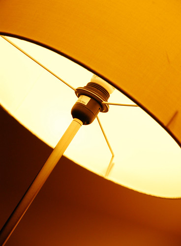
i'm going to beg to differ here and say that it is not a horrible shot, nor is it without merit. however, it does fall into the category of a shot which works better as a part of series, perhaps of the same lamp from different angles. there is effort and thought in composition here, but it cannot hold water as a standalone shot, because it is simply.. not interesting enough.

something with more character, perhaps a play of light and shadow, for instance.. would be better suited as a standalone shot here.

that said, choice of WB and exposure seems ok to me. keep shooting.
 

thanks alot for everyone's comments. :)

nigel84, include the entire shade? or just a little of the top? i think if i were to include the entire shade, it wouldnt turn out good. well, at least i think i cant pull off a shot like that.. :bsmilie:
 

hmmm. coming to think of it, you just made a point here. I ain't very sure how it would turn out, but i think just a little of the top should do just fine. Sorry for the mis-conception. :)
 

hmmm. coming to think of it, you just made a point here. I ain't very sure how it would turn out, but i think just a little of the top should do just fine. Sorry for the mis-conception. :)

no worries... i just needed some ideas and comments so that i can improve. i;m still new to this.. :) anyway, thanks the comments.
 

Status
Not open for further replies.