
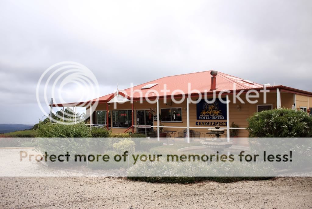
Please give your comments on this picture. Is the angle ok? Colour settings etc? Anything to improve on?

if you don't mind, i edited it to show you what i think people would like to see
this is a good way to convert something that looks flat into something eye catching and probably more impactful.
i can delete it if you want :embrass:
*the blown out parts can't be helped.. working in low res jpeg.
")
You created a very big hotspot in the sky. Sorry not my cup of tea.
No expert here but a few suggestions:
1. U could have capture this shot from a lower angle. Try shooting low, even if it means lying on the ground. Take with the sky as the backdrop to create the impactful pic.
2. Timing of the shot. Its a cloudy day and quite hard to bring out the feel if shooting in this conditions (unless its a stormy cloudy afternoon etc). Btw, is this shot taken at afternoon timing. If u r travelling on a tight schedule with a tour group, it may be inevitable that u r shooting this at this time. Else, u could have taken this during sunrise/sunset timing which would bring abt a stronger feel.
3. Contrast. peepeedog has done quite a nice job for creating the contrasty version. Weather and angle of shoot is causing some blown highlights in the sky as well as the roof. U might wan to invest in a ND filter/polarizer when taking landscape/scenic shots.
However, its really the point of time of capture that matters. Plan what u wan to shoot, think abt a theme to shoot, find an angle to shoot before u press down the shutter. Keep on shooting... We r all learning along the way! :thumbsup:
on original file - weak composition, typical and not much thought put in. the exposure is alright but definitely some work could be done to retrieve the details in the sky.
try different angles, walk around, squat down, tip toe, there will definitely be a more flattering angle which conveys a stronger idea.. or at least provide a stronger composition
the edited photo is surely, an improvement , hot spots aside.. i'm sure with careful layering the details under the roof can be retained, though that may need a bit more work.
Please give your comments on this picture. Is the angle ok? Colour settings etc? Anything to improve on?
if you don't mind, i edited it to show you what i think people would like to see
this is a good way to convert something that looks flat into something eye catching and probably more impactful.
i can delete it if you want :embrass:
*the blown out parts can't be helped.. working in low res jpeg.

Hi JohnnyW,
Composition might not be that much great and not much bad. Picture looks very simple and bit flat for me. Any way you should practice with you Post processing skills to enhance your picture well. Photoshop is very easy and great software to tune your image.
I'm sorry to say this to peepeedog, your post image is not my good for me and your reason too.
Well, let me tell you.. want i did in your image.
>> Cropped at the top
>> added some perspective to show some depth
>> Clouds are copied, pasted in new layer, desaturate it and change the layer in Multiply.
>> Hue adjusted 4 times in different areas with layer mask.
>> Image sharpened
>> Contrast increased
>> From Burn tool, pillars contrast burnt to highlight graphical lines
>> Framed.
hope you like improvements
Look like this topic is very interesting.
As my point of view, when I look at the photo, I am interested to see the water area,the word on the and then the entrance staircase.
So I crop until like this.:bsmilie:

actually, i feel that no matter how much PP is done to this picture, it remains pretty "ordinary".
just the type of Point n Shoot pic (dun misunderstand, i shoot plenty of these straight forward record shots nowadays).
actually, after all the PP, the very initial shot still does the job, which is to tell ppl that, "here's a pic of Motel Bistro."
PP can make a potential shot outstanding, but it will never make something "ordinary" extraordinary.
