
exposure: 0.003 sec (1/400)
Aperture: f/5.6
Focal Length: 6 mm
ISO Speed: 100
Exposure Bias: 0/10 EV
Flash: Flash did not fire
Camera: Sony p73
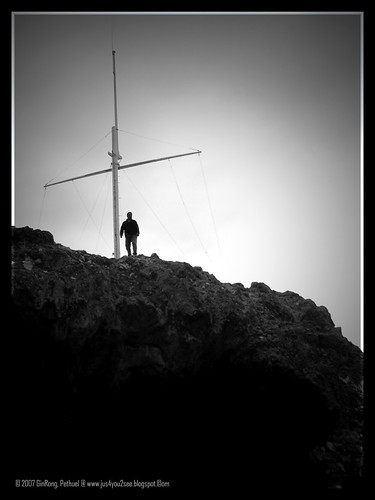
jus want to share this photo i took during my trip to newzealand....
jus wondering.. have i put too much vignetting into the photo?? coz the sky on that day was soo cloudy.. and not much details.. so i tot by add the vignetting would "bring out" the cross and the person beside
I also cropped jus a little to position the picture to the 4:3 rule (top left side)...
and... it looks like a b/w picture... but the colour that day was as such... not desaturated....
any comments? or critique?
")
