thanks for the feedback. Care to explain the asthetics of why you feel the crop may deem the image more appealing to you? Cos i kinda reckon there has to be a reason to why u feel that way. :dunno: do share.
")
with pleasure Chris.
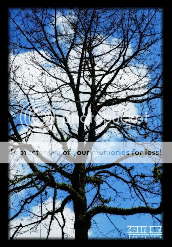
Essentially when I see the image i see the main trunk in the middle of the frame, i am lost in search for symmetry which is missing here because the subject is not symmetric in the first place. I also get lost in the paths i should take to the top and rest of the image, the branches on the right are more unidirectional then those on left.
the next thing i find is a disbalance due to the clouds in the bg. they are taking up too much space on the left side, distracting from the main subject at the same time.
near the top, the branches end up in too many smaller branches losing me amongst them, thereby blocking my reentry into the image from top. i would prefer dominant branches leading the way out and allowing a way in as on the right. plus, there is some blue on top of white which again disbalances the pic.
when i crop this the way i mentioned above, i find the dominant white on left is reduced and so is the non-directional branches, limiting your stray paths through the pics. what you will be left with the is blue and white balanced on the right of the image and branches leading your way upward.
ofcourse you may see things differently, but that's my perception of the image. above all, beauty has no single definition.